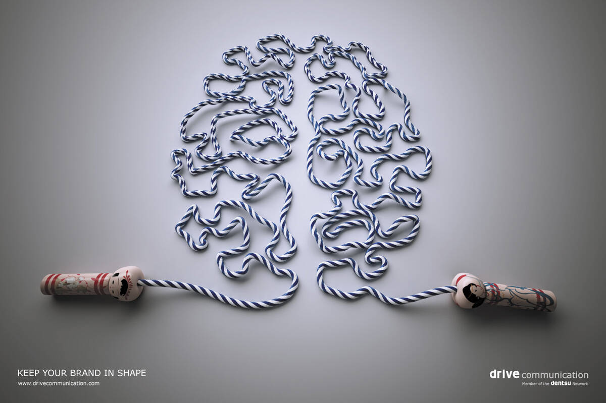
Drive Communication: Brain fitness

Drive Communication: Brain fitness

Keep your brand in shape.

Advertising Agency: Drive Communication, Dubai, UAE
Creative Director: Gaël Chevolleau
Art Director: Krystel Hoche
Published: March 2008

Your rating: None Average: 5 (8 votes)

Comments

Nice

Le Douche's picture

nice, but i think The Economist did the brain thing better.

sonucoues2002's picture

right

yeah, this is too close for comfort to the economist ad.

jazarah's picture

nice, i like it

http://jazarah.net/blog/

jazarah's picture

nice, i like it

http://jazarah.net/blog/

decent.

miko1aj's picture

No, no, no. It's different than Economist ad and I cannot agree it's worse. This symbol is so powerful and simple that it don't even necessarily need any line (which is the worst part of this image). I like it very much. I appreciate that someone found another good one way to show this idea.

actually... both are using the symbol for brain to make a direct connection to their brand and are suggesting they help keeping said brain healthy. that's the same idea. the other problem here is that the economist campaign is iconic. if there had been two little-kown campaigns I would have chalked this up as "they didn't know of each other" but alas, this merely suggests they ripped amv bbdo off. which is why in a forum built to show your work to other creatives they shouldn't get any respect.

Pogi5's picture

joelapompe where art thou?

I agree with Le Douche, The Economist was professional, this is just ok.

ivan's picture

not bad.

your work is your identity.
http://harshikcreations.blogspot.com/

I like this for what it is. Economist or no Economist.

Oh hullo.

e-c-o-n-m-i-s-t.

Just missing the 'oh...' factor.

nice

REALLY NICE!

nice !

Done

saymawa's picture

did you hurt yourself coming up with such constructive criticism?

smart idea