China Environment Protection Foundation
Industrial pollution, Global warming, Automotive pollution
Agency: JWT
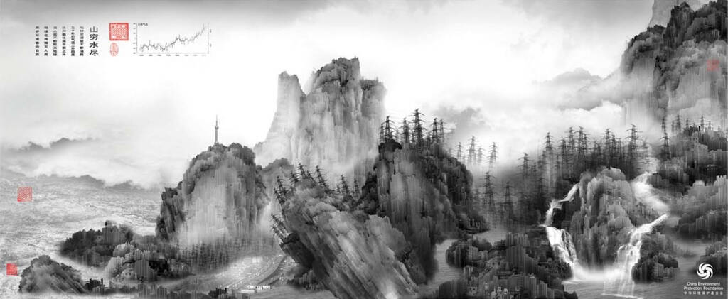
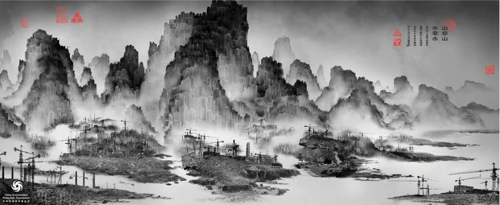
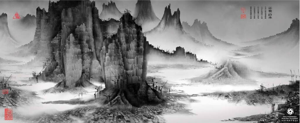
This professional campaign titled 'Industrial pollution, Global warming, Automotive pollution' was published in China in April, 2009. It was created for the brand: China Environment Protection Foundation, by ad agency: JWT. This Print medium campaign is related to the Public Interest industry and contains 3 media assets. It was submitted over 17 years ago.
Credits
Advertising Agency: JWT Shanghai, China