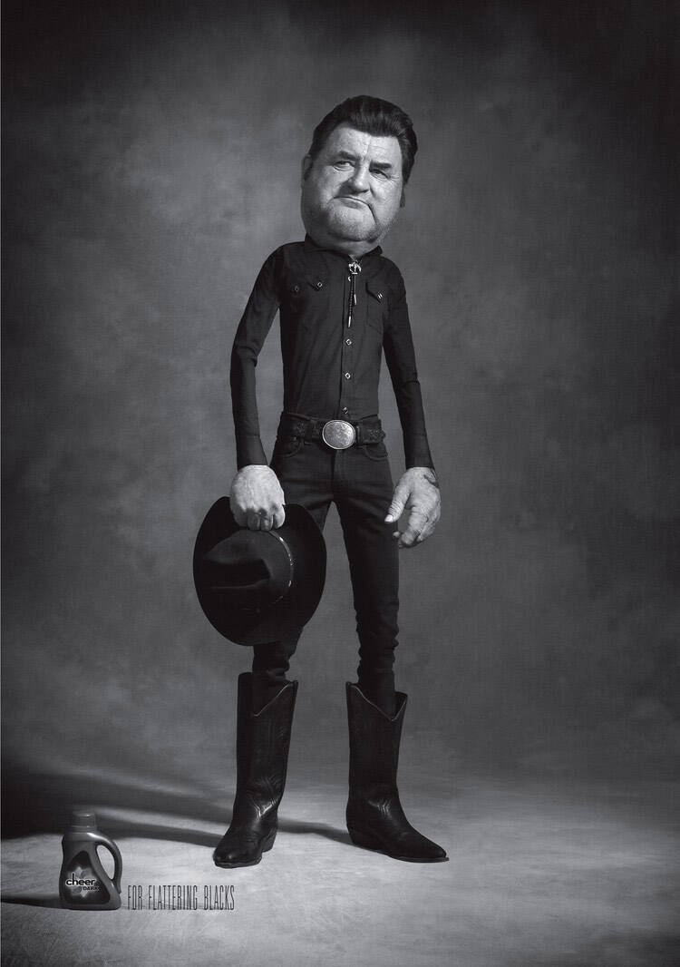
Cheer Dark: For flattering blacks, 3
Advertising Agency: Leo Burnett, Toronto, Canada
Photography Studio: Ishi Studios
Creative Directors: Israel Diaz
Art Directors: Anthony Chelvanathan, Israel Diaz
Copywriter: Steve Persico
Photographer: Ishi
Chief Creative Officer: Judy John
Art Buyer: Heather Morton


20 Comments
Wow, get ready to rake in the awards.
--
brandon
www.brandonknowlden.com
haha, very good. clear and simple
-an opinion, assimilated, is one wasted.
nicely executed
product looks like a motor oil to me... but i like the ad
Creativity is a natural extension of our enthusiasm
true, true... this is really outstanding.
Well apart from looking like the younger Johnny Vegas it's great.
and visually hit's the nail on the head
www.jpmountford.com
www.jpmountford.com
Amazing production, funny, eye catching. Need more? Congrats.
The best of the three. This one looks least like some malformed homunculus.
Great idea, but the other two seem to overdo it. The slim bodies are slimmer than the slimmest slim person. You can tell from the neck that the person is fat, so why make the body out of toothpicks? A regular thin person would do.
"You can tell from the neck that the person is fat, so why make the body out of toothpicks?" - i think you dont really get this ad. The person really IS fat, but wearing black makes him look slimmer than he is. And it's called exageration.
On another note the art direction is amazing, the cartoonish look makes the characters enjoyable and funny.
very nice job, i don´t see an award comming but it´s really great.
this is absolutely marvelous!
| Everartz |
Hilarious!
Great ads
@Jorge21:
why should we look at that?
nicely done me like it ;-)
www.thecuriousbrain.com
luv it, excellent art direction and really good idea!
great
Idea is too literal. Art is ok
Good Job, long live Tim Burton