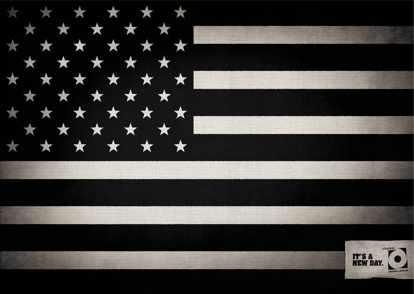
Channel O: Stars and stripes
It's a new day.
Advertising Agency: Ogilvy, Johannesburg, South Africa
Creative Director: Jonathan Beggs
Art Directors: Thule Ngcese, Carl Willoughby
Copywriter: Mbulelo Nhlapo
Account Director: Kay Motuba-Warie
It's a new day.
Advertising Agency: Ogilvy, Johannesburg, South Africa
Creative Director: Jonathan Beggs
Art Directors: Thule Ngcese, Carl Willoughby
Copywriter: Mbulelo Nhlapo
Account Director: Kay Motuba-Warie
Ads of the World advertising archive and community showcases fresh creative campaigns daily from around the world. Read more
If you need a logo for your company or product you can get it done with us.
In our logo store you can pick from over 28,000 pre-made logos that will be customized to your name for free or you can post a contest for us for just $250 and our designers from all over the world will submit dozens of logo design suggestions to your specific needs.
43 Comments
original: fail
african: fail
this is awesome,fresh, and execution is a 10. portfolio piece for sure.
I guess I'm missing something, because this just does nothing for me... :/
sarcasm
This is dangerous work for SA before the worlcup. Ogilvy SA did some ads "proudly black", "back to black" etc....i think this is the most racist way to see proudly South Africans and it is wrong. Can you imagen arriving in USA or EU and see a bilboard "proudly white" ???? In China "proudly red"??? NO you can not!!!!....so let's revue our real values,all (black, red, white or brown..) SA are proudly Africans.
Concerning this campaign US black flag "Obama", it depends what angle you looking at to a used bottle of wine, for some people is half empty and others half full....50/50 white & black.(you chose you fk angle...but it will not change the reality of things)....see you bud.
need a layout with the white house:)
awesome!!!
crap, absolute crap and insulting.
What's is your point, Mr. Creative?
no.
Funny a South African came up with that.
Racist pigs.
2 creatives are black dudes. funny that.
Funny a South African came up with that.
Racist.
I must be missing something, because I dont get the connection here at all.
--------------------------
Here, let me save everyone the trouble of asking. "Do you even work in advertising?"
I think what the ad is trying to say is that America doesn't see color anymore when electing for a president, hence the desaturated flag. I don't think this ad is racist at all. Some of you people should really think before you say anything.
wow! flippin sweet credentials on your name there guy..........i should change my name to "Edward Bernays @ Who gives a shit where I work"
but yea, black white, no color to flag...still first/second stage idea, nice logo though!
*sigh* This world is so full of hate innit? A guy can't even put his place of work and he gets denounced. Did I ever do anything to you Mr Edward Bernays to receive such hateful remarks from you? I mean seriously, does me putting my place of work really deserve a telling off? It's people like you that guns and armies are still around. Think about it Mr Edward Bernays.
Oh and feel free to reply this with more smart remarks. I'm sure you have plenty.
i didn't get it in the beginning. I was guessing that does it mean now america is in all black? But having seen the last comment, i guess that's the message the ad is trying to get across. However, i still don't get the meaning of no color now in america. Coz there are still black and white in the flag. It turns on to be america still split in black and white. If no color is what they are trying to say, i think a simple line drawing without any black or white space would be better.
Black and white (in design/art world) isn't really a color. But yeah I can see how the whole b/w thing can be easily mistaken.
No point. Doesn't work! It will be "a new "grey" day..."
izmild
http://uniquetvcomm.blogspot.com
not there yet.
to the guest commenter who says south africans are racist: i hope you die soon...ps we arn't racist anymore just sick of intolerence
to the one calling south africans racist...please grow up with your childish intolerence....we have been a democracy for 14 years... get with the program
i agree, good insight in the ad if you look at the brands identity
Now I get it, it's kinda cool.
traaash...
It could mean:
"Time to think black and white."
"Red skins are defeated, time to show the black skins."
or maybe
"Guys, we have a black president! It!s such a great news, that the color itself will do just any concept!"
I think they show the wrong idea.. if they want to say that they don't look at colors now in america.. this can pass the wrong idea, the idea that now they divided everything into black or white.. either on or the other..
just bad, i think..
Yeah... and it ends up racist, even unwantedly... it's a paradox, but making the color not count, they made the difference much bigger. If they did the opposite, the message could be clear and based on the obvious. Just imagine the flag BLACK & RED, instead of black & white... first black presdent of the US makes a brand new day.
This ad is boring, uninspiring, laregly messageless and just plain crap.
And for those who say it's racist. It's not, it's just dull.
2/10
This ad sucks
This ad is extreme boring, no meaning at all...
nothing like letting a bunch of creatives get together if you want a good oul bitch lol
wow, this is probably one of the worst adverts I've ever seen. honestly terrible.
stupid
either i don't get it or it's really crap. i'm pretty sure it's crap though.
Has America moved into the world of black and white (60s) after Obama got elected? Is it a progress in the reverse direction?
so lame.
this is so pathetic.
f$%$cking stupid.
How ironic that the most opinionated people in advertising have the worst spelling, vocab, grammar and overall language use. You don't have to be a writer to spell but don't shoot yourself in the foot with attempts at insightful insults when your efforts on a comment are not even spelled correctly and you're too lazy to re-read it once.
I understand what they’re trying to say but it’s just not coming through. Sorry for being negative, but this is really, really not up to scratch for Ogilvy.
I dont think its bad