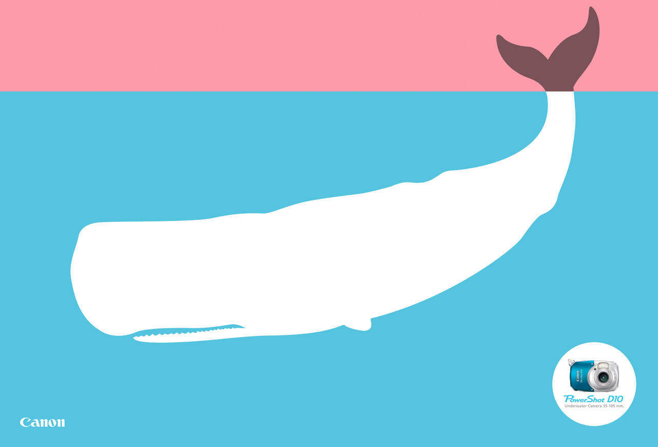
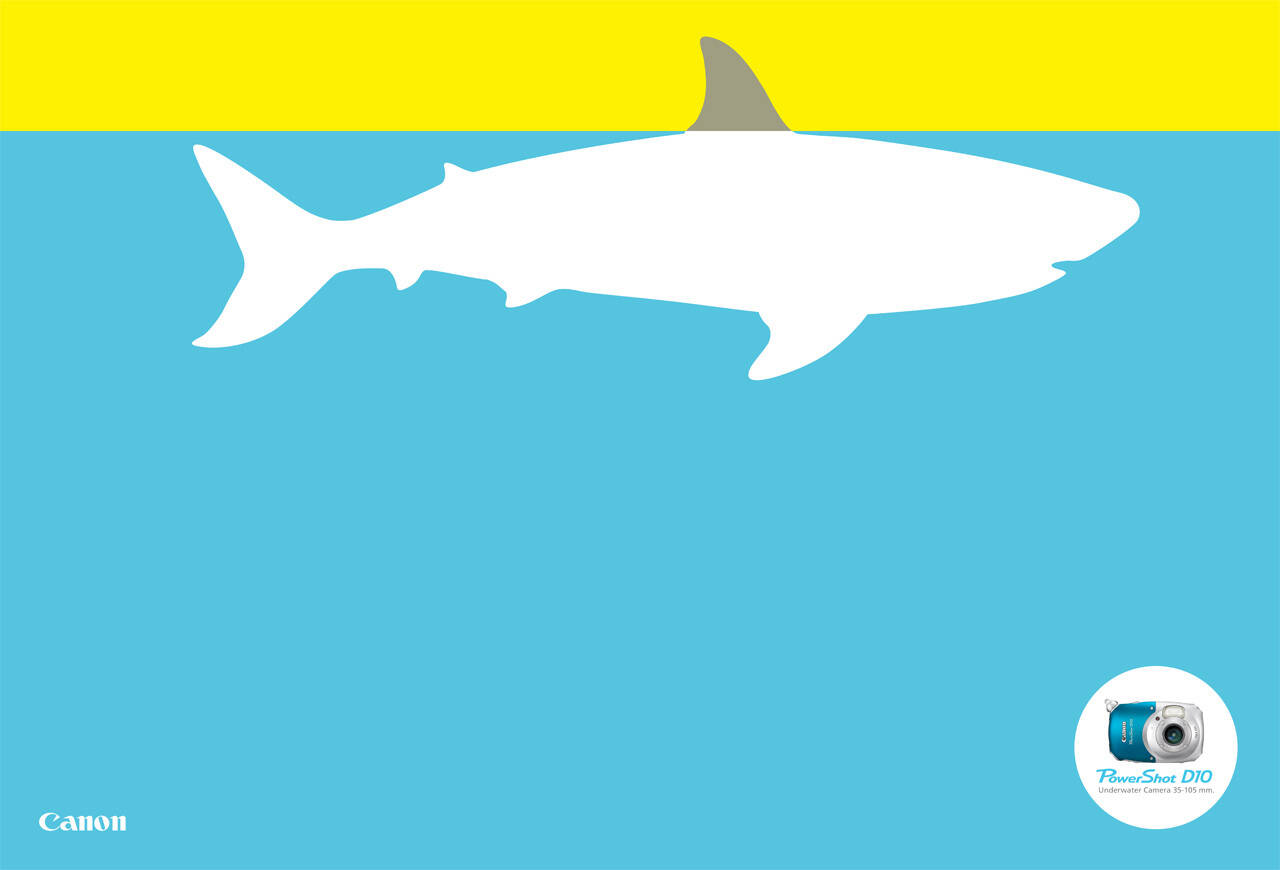
Canon: There's more under water, Whale
Advertising Agency: Giovanni+DraftFCB, Brazil
Creative Directors: Adilson Xavier, Ricardo John, Benjamin Yung Jr
Art Director: Henrique Del Lama
Copywriter: Marcelo Jun Sato
Illustrator: Henrique Del Lama
Art Buyer: Tina Castro


21 Comments
Interesting. The layout, colors and whale graphic were done last year for the Hangout Music Festival.
sorry, don't get it
What????? I have no idea what this means.
Interesting.
I am not so sure this really sells the product though???
I'm trying to like it, but there's been done so many great ads promoting underwater camera's.
Quite like these, a good point about more things under the sea, surprised they didn't use an iceberg?
Haven't seen this direction before for a camera, kinda like 'who care's how good the picture is, it will still get more underwater'.
www.creativeduck.blogspot.com
Unremarkable.
Write a wise saying and your name will live forever – Anonymous.
http://www.anonymousauthor.co.nz
www.twitter.com/@anonauth
My take is there's a lot more to see underwater, so better get this cam.
People who are in the market for underwater cameras (cameras specifically made for underwater use and not "waterproof cameras") are, for the most part, people who spend time underwater, so these ads don't have to sell the option but just announce the existence of the product. If so, I think they work well: striking graphics that don't have to be groundbreaking (to anyone but those that spend time critiquing this stuff); a clear comment on what the product is for; and a nice visual tie-in to the style of the product.
Award winning? No.
Good job to sell? I think yes.
Nicely put. Agreed.
"Ubi hubave lubearned thubat ubanuby fubool cuban wrubite uba bubad ubad, bubut thubat ubit tubakes uba rubeal gubenubiubus tubo kubeep hubis hubands uboff uba gubood ubone."
-Lubeo Buburnubett
Sharply thought through. I'd struggled with the simplicity of these, but your pointing out the audience made a 'ding' go off, thanks.
Simple and eye-catching. I love the colour combinations and how it makes me want to read what is written in the circle with the camera in it.
http://adbuzzer.wordpress.com
yes
yup...v simple n eye-catching..gud enuf..!
So "There's more under water" isn't actually written on the ad? I think it needs it.
Okay.
like it...
ANY1 EXPLAIN THIS ABSTRACT PIECE OF ART
My guess is that it is like a graph to measure how much you see (top part/color) and how much you COULD see underwater with the camera. But yeah, if you don't get it at first it just doesn't work. Nice design and colors though.
ANY1 EXPLAIN THIS ABSTRACT PIECE OF ART