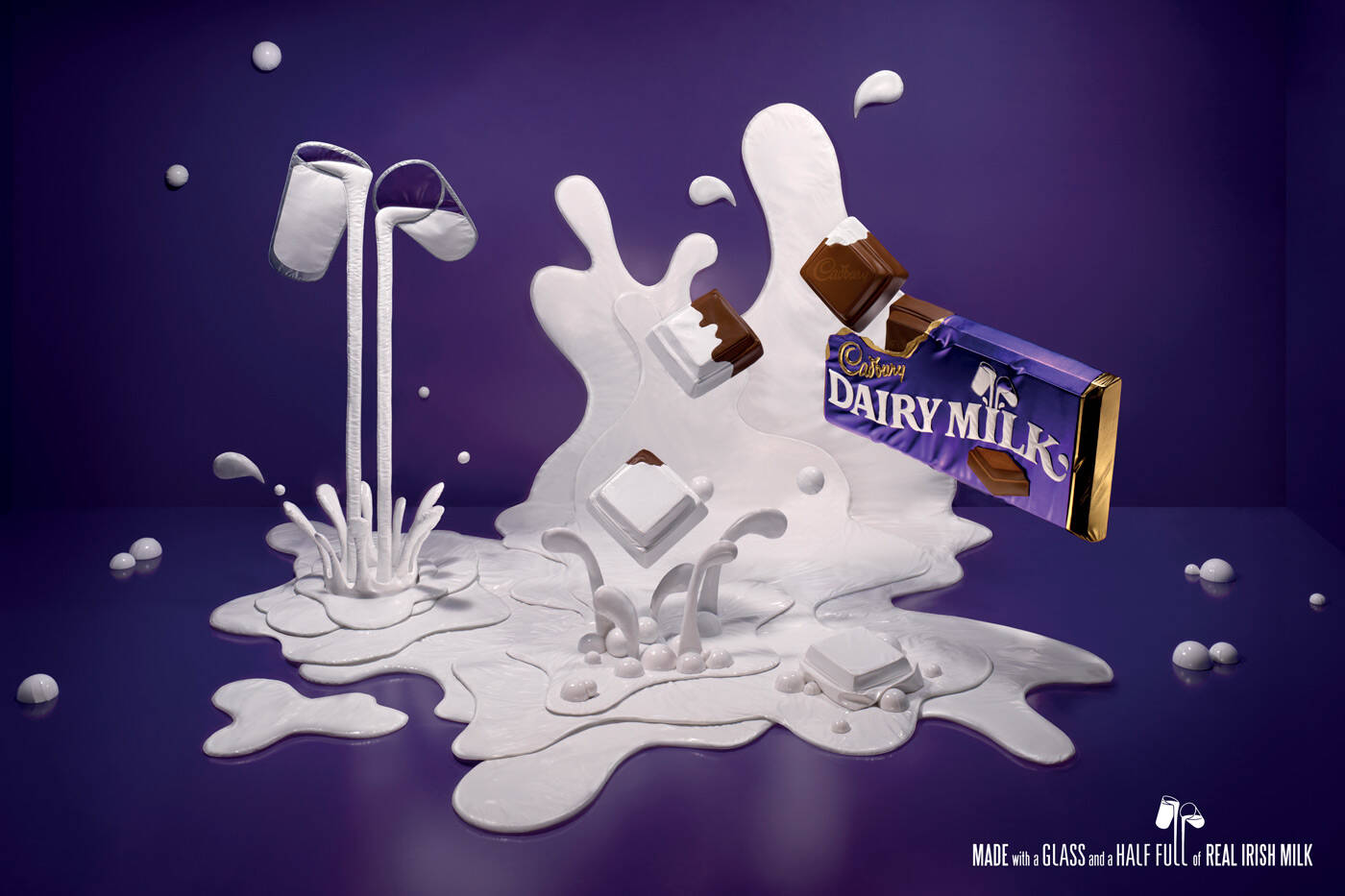
Cadbury: Creation
Made with a glass and a half full of real Irish milk.
Advertising Agency: Publicis QMP, Dublin, Ireland
Creative Director / Copywriter: Ronan Nulty
Art Director: Keith Doyle
Photographer: Marcel Christ
Set Designer: Rachel Thomas
Published: July 2009


17 Comments
I can't following it
I don't understand
visual is nice but the idea is not clear.
Nice craft. But I don't get it.
Um, not to be rude, but this isn't really hard to get...at all. The chocolate has a glass and a half of milk in it...not really rocket science.
Tweet tweet: @ThisAbility
What you have just explained is the brand message. What the visual imply? What about the Irish milk?
I'm with Alvinpck. Why even mention the "Irish" if you're not going to take advantage of it? Just say "milk". If they DID follow the "Irish Milk", angle, this could actually go somewhere. Show a leprechaun "magically" putting milk in a bar, or a beautiful redhead in a gorgeous field weaving strings of milk into a bar on a chocolate weave. Something. Right now it's just a "sculpture" with no reason for being. Plus - there's way more than a glass-and-a-half of milk spilled out.
Maybe I'm missing something. Maybe in Ireland things come out of the water/magical springs different than when they go in? Anyone local wanna explain?
People like to know things are made with produce from their own country. Hence, Irish milk.
It says Irish so people know the chocolate is made from Irish produce - supporting Irish jobs etc.
Cheers Leland - I get that - but that's like putting a pretty picture of a bacon double cheeseburger on an ad and saying "Made with 100% Canadian Cheddar" and not making a visual reference to it in the shot. So what? If the Canadian Cheddar message is so important, you better sell me on why eating Canadian Cheese is important. If it's pride, put a flag on it. If it's keeping Canadian jobs, show happy farmers. Something to show me how this is relevant. As-is, this ad is just a pretty sculpture with a perfunctory "Buy Irish" label tacked on.
Leland - the above was me - forgot to sign in ;-)
I love looking at it! but i dont get it. nice art direction
very nice visual
Really like the milk golf clubs and balls, nice work, but???? dont get it
why?the copy is spectacular!
It's a very nice piece of design, and a different way of doing the 'glass and a half pouring' thing that is a part of the brand but has become wallpaper.
The 'Irish' thing is to show they're supporting / part of the local economy and community.
For those that 'don't get it' or are looking for a 'big idea', you are looking for something that is not there. It's just a nice way to freshen up a tired but important part of the brand.
Well, if it was suppose too look like milk, it's really strange, if it was supposed to look like plastic, really good, if it was supposed to look like a pouf, really cool, but if you went a little further and transformed it in to an action in a city space.. uau, lol!
.: look for the green giant on the label :.