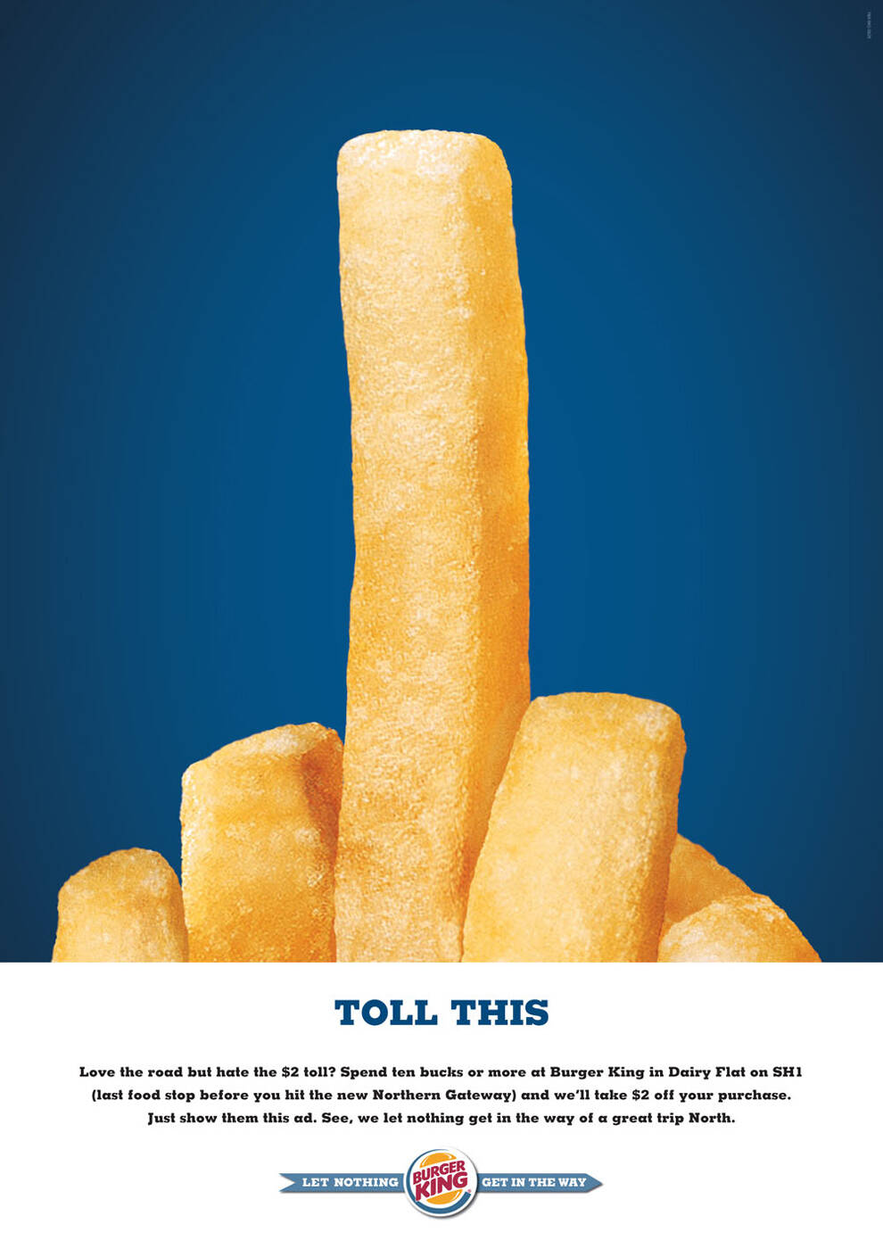
Burger King: Toll this
Advertising Agency: Y&R Auckland, New Zealand
Creative Director: Vaughn Davis
Art Director: David Bell
Copywriter: Richard Loseby
Via: Bestadsontv
Advertising Agency: Y&R Auckland, New Zealand
Creative Director: Vaughn Davis
Art Director: David Bell
Copywriter: Richard Loseby
Via: Bestadsontv
Ads of the World advertising archive and community showcases fresh creative campaigns daily from around the world. Read more
29 Comments
lol funny...
For to be saw this yes in time ago before.
Funning on bird is for to be ha ha, but NO, not to be ha ha.
Thinking NO!!
In what lenguage are you writing??
not ha ha be funning thinking NO?????
my man, u should go se a doctor. seems like someone lobotomized u while u were buttf%^king your teddy bear...
What the f...? Engrish.com for this dude.
That comment is just too hilarious
funny, the fries look like those long tubular pool toys you beat on each other with though.
Been do a stack of times using fries, fork tines and stuff.
no more things that look like the middle finger! for the love of god. this has been done a million times! terrible!
seen this done with toes, buildings, forks, etc etc etc
new idea please.
1/10
dum de dum
enough with the fries, please!
Tasteless.
----------------
Just an opinion.
----------------
Just an opinion.
http://myappleapps.blogspot.com/
http://mimundoenotromundo.blogspot.com/
mmmm i dont like it
www.barcreativo.com
just looks like a greasy deep fried chip...
zzzzz.....chips = hands = zap = countless previous McDonalds ads. Just not good enough for BK
bad art direction....
c'mon....its not that bad. i think its funny.
almost all ideas are taken people, that doesnt mean u can never use the same idea again. u can always give it a novel look and make a new ad. in my opinion - its funny :D
Totally agree. This site is a fantastic showcase for great work but it seems people seem to enjoy destroying another piece of work to justify their own importance. Admittedly there is a lot of work on here which uses great photography and artwork to gloss over the fact the initial idea is poor some of the comments are slightly zealous and unjustified. Like everyone else this is just my opinion. BTW, don't really like the ad. Bit offensive for my liking.
I hate her mother!
And, in related note, a bit lame but at least is not a bent fork again. And, we all do like dirty humour a bit right?
http://www.stillad.com
What a superb idea!!!!
Love it!!
Isn't palatable.
http://mediame.com/sites/default/files/images/Mo%27menfries.jpg
http://ferdi-rizkiyanto.blogspot.com/
I think it's funny. I wish it said, "Bite me" instead.
-Natalie
http://www.nataliemarion.com
Done in Brazil.
done in every country for every product at least 3 times a year
Yeah, nice
http://www.joelapompe.net/2007/10/25/fork-as-fuck-you-sign/
Just because it's been done doesn't mean it isn't effective. In fact the opposite is true, maybe it's been done a million times because it IS effective. Remember, the average person thinks this stuff is funny, even if they find it offensive, it'll get their attention. If the fries don't get their attention the saving $2 will.
I think sometimes designers get so stuck in their own little art world that they forget who the real consumer is. The consumer is not a snarky critic posting comments on this site. They are the one out buying stupid french fries and saving 2 bucks.