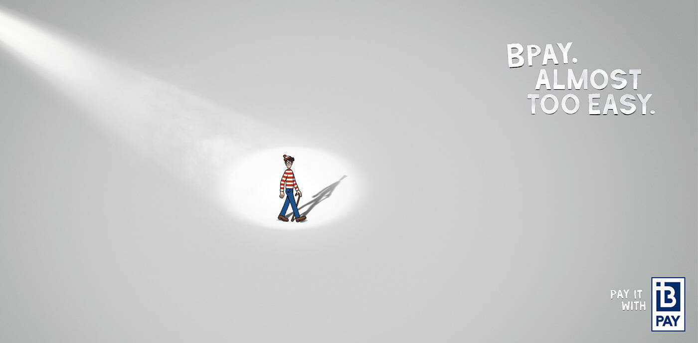
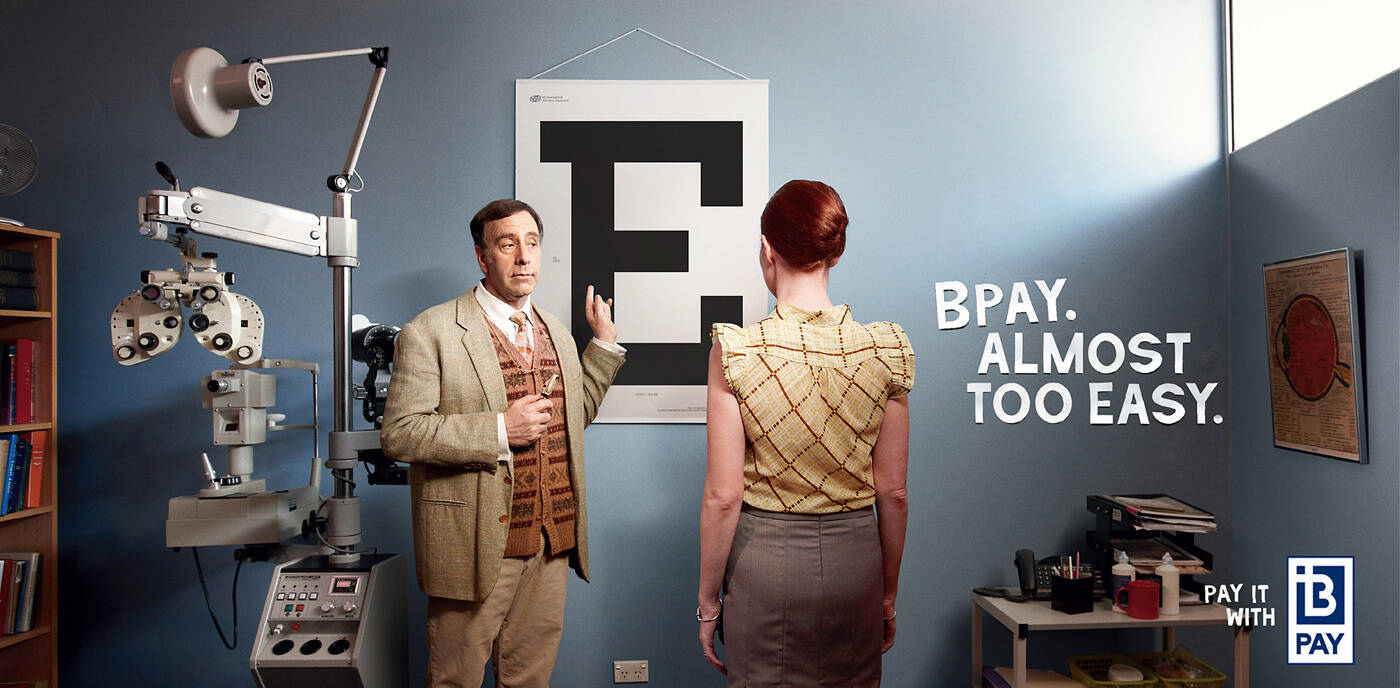
BPAY: Optometrist
Bpay. Almost too easy.
Advertising Agency: BMF, Sydney, Australia
Account manager: Natalie Downes, Danielle Theodosi
Photographer: Andreas Bommert
Executive Creative Director: Warren Brown
Creative Director: Dylan Taylor
Art Director: JJ Winlove
Copywriter: Keith Cox
Strategic Planner: Christina Aventi
Art Buyer: Leesa Murray
Production Company: Look
Media Agency: Ikon
PR Agency: Wrights PR


9 comments
Yes, it's EASY
Easy to think on it too..
***
http://ad-genius.blogspot.com/
Advertiser who won 10 or more lions in the last 10 years.
And I am not the real Juan Cabral, guys. So sorry for that!
eye doctors office would never have that open light. They need darkness to check your eyes. But besides that I like it
who cares, it's an ad let your imagination go a bit, realism is obviously already out the window
cheers,
dlue
don´t know wich strange reason make me like it
but what does this have to do with the brand?! You could post any other logo from the competition and it would still work. It has absolutely no connection with the brand or the target what so ever!
Would be better if it would actually related to the product...
Well, checking your eyes isn't a competition in the first place. And the message that using some financial service is just EASY? Easy HOW? Aren't you supposed to tell your target audience what the hell are you talking about anymore? Using Bpay is easy like spotting Waldo in a plain grey background...so, you know, use it! That's wrong. That's totally wasting your effort and client's money.
almost too easy to forget also
-------------------------------------------------------------------
~ Quite obviously, I have gathered no moss ! ~