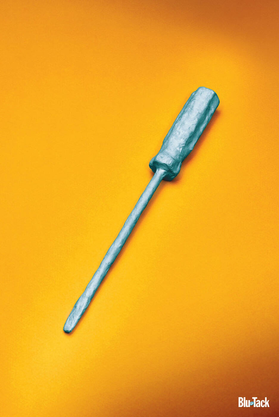
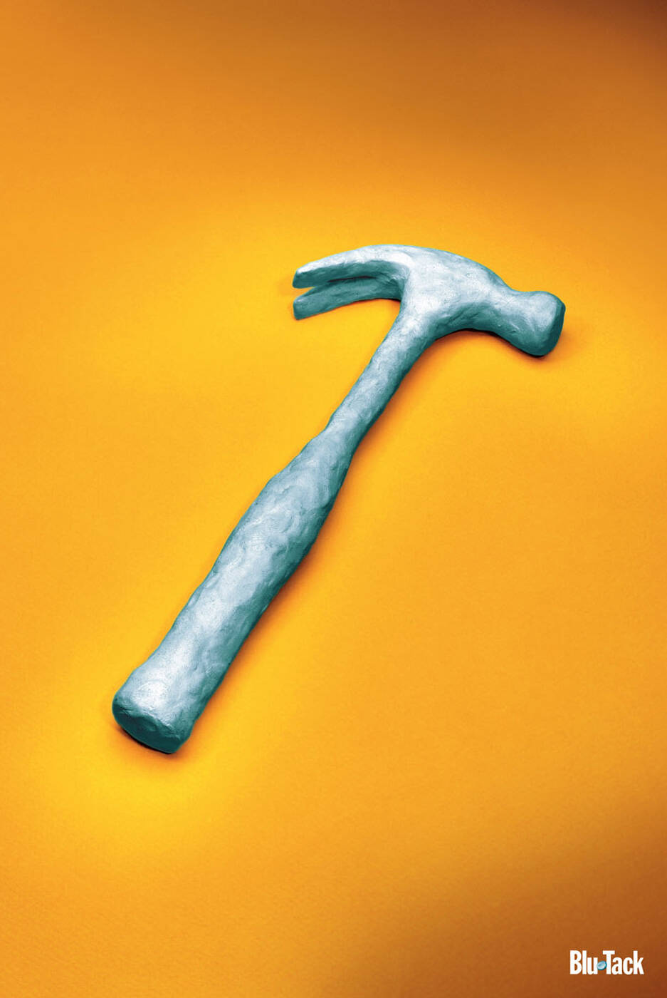
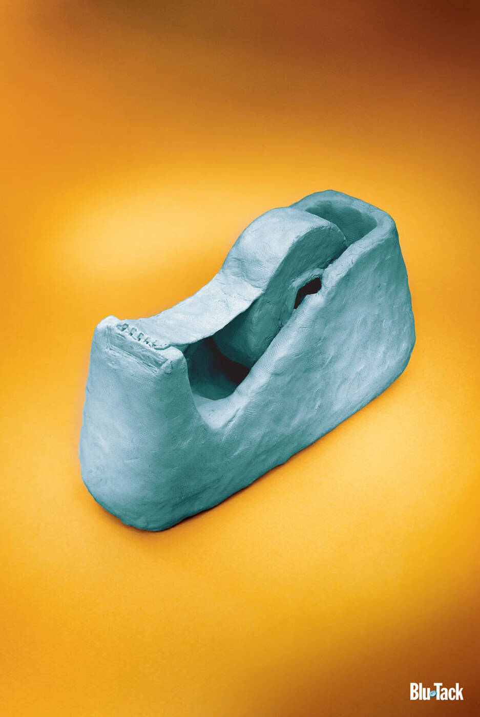
This professional campaign titled 'Tape, Screwdriver, Hammer' was published in Australia in March, 2009. It was created for the brand: Blu Tack, by ad agency: The Brand Agency. This Print medium campaign is related to the House, Garden industry and contains 3 media assets. It was submitted about 17 years ago.
Credits
Advertising Agency: The Brand Agency, Perth, Australia
Creative Director: Craig Buchanan
Art Directors: Craig Buchanan
Photographer: Allan Myles
Copywriter: Des Hameister


