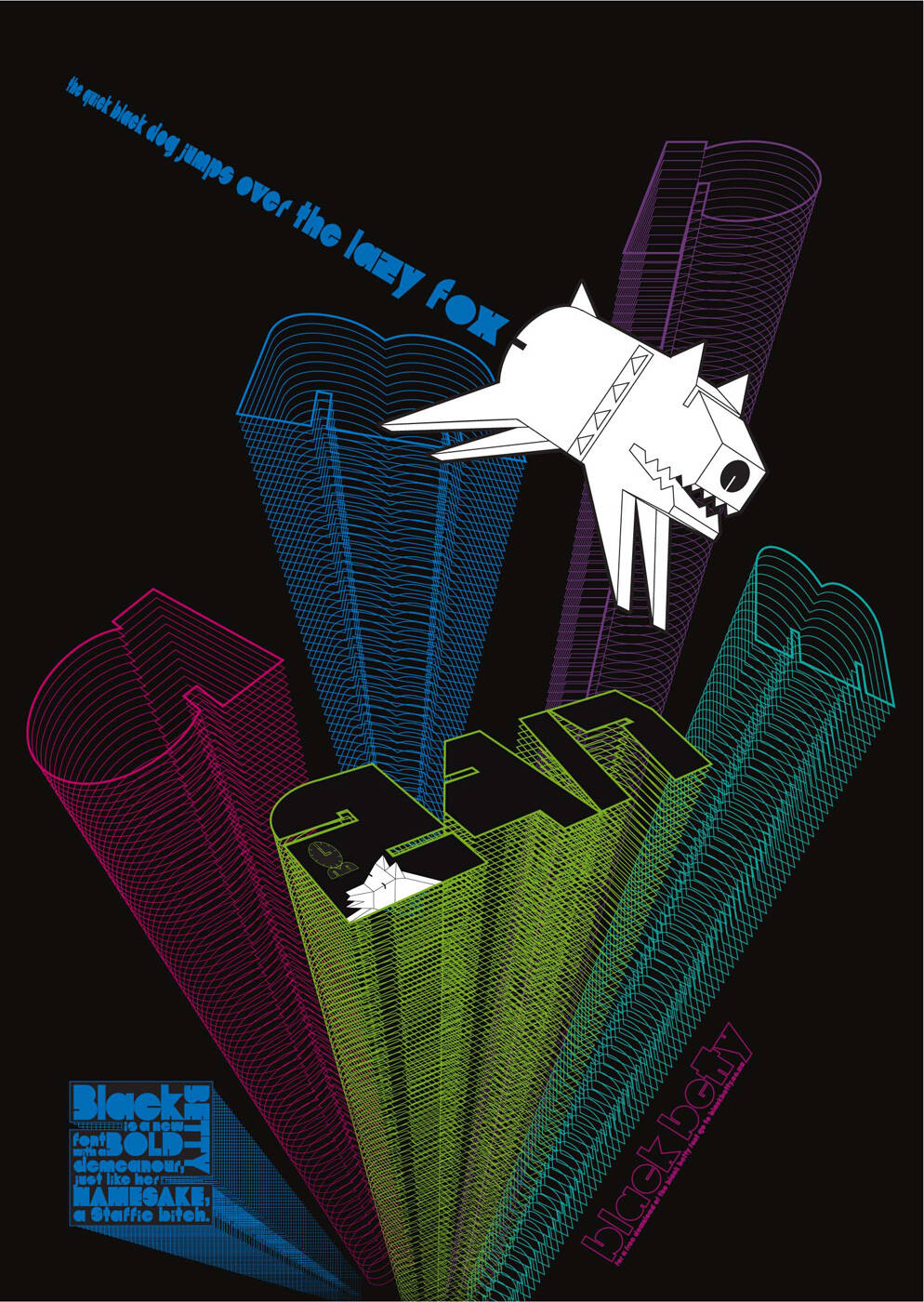
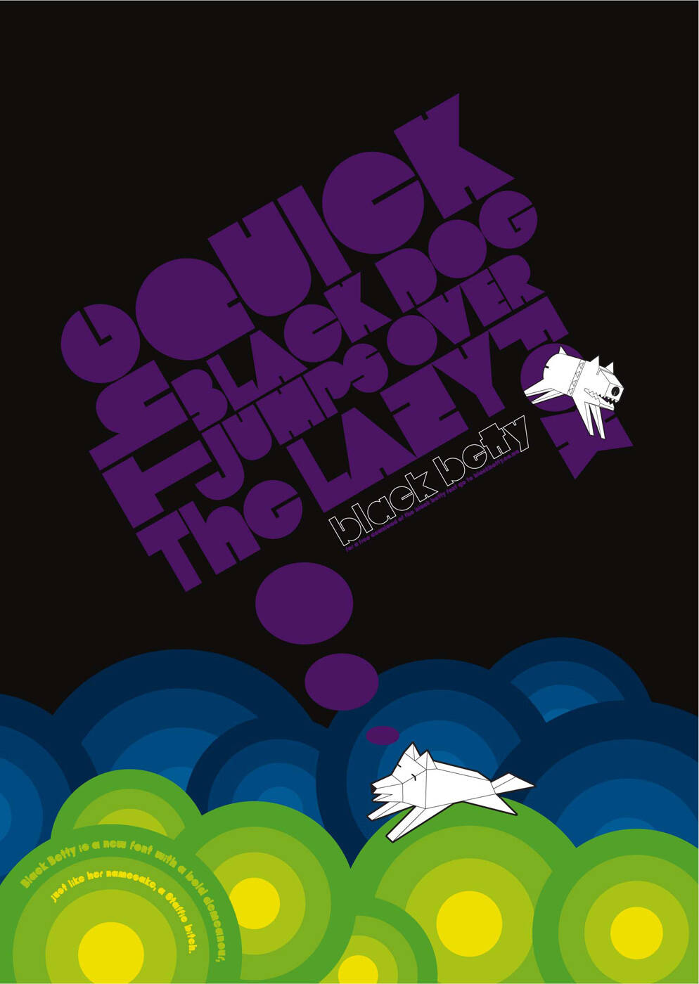
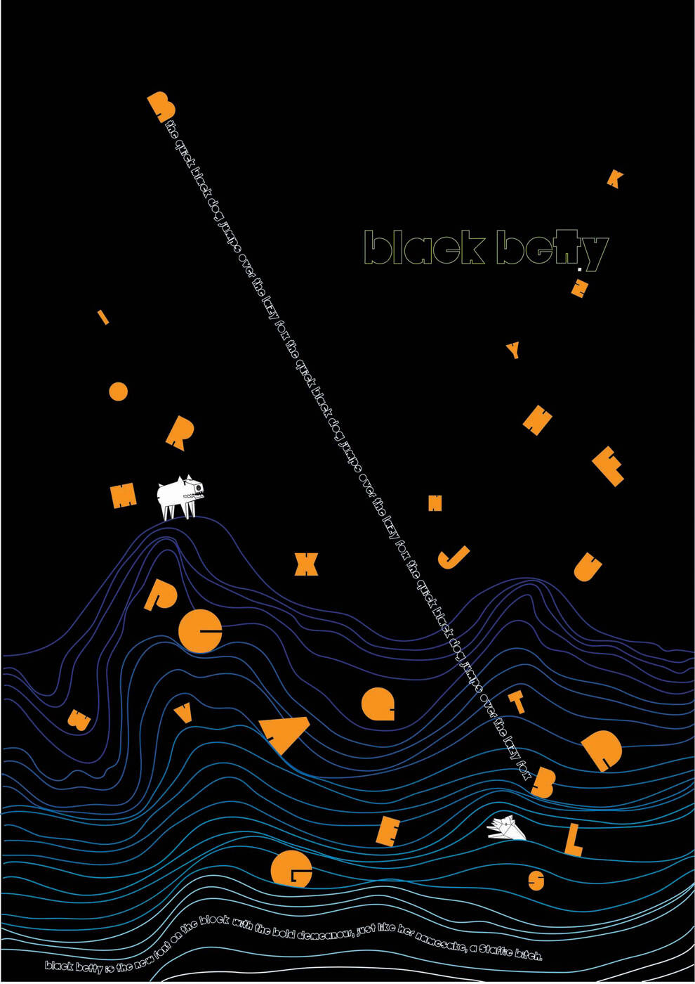
Black Betty: Dog

Black Betty: Dog

Advertising Agency: BBDO Cape Town, South Africa
Creative Director: Quentin Arendse
Art Directors / Illustrators: John Letherbarrow, Agata Niemkiewicz
Copywriters: Hilton Mashonga, Richard Lamb-Hughs

Your rating: None Average: 3.3 (4 votes)

Comments

tomotzi's picture

has this any content or is it only decorative?
The Typo is unreadable. a bit 80th style. trendy but nothing new.

ogilvyandmenon's picture

just like her namesake a staffie bitch ?

Dozer's picture

don't understand it....

Satria280471's picture

I had to go about 2 inches from my monitor to find out, its about a site that give free downloads of fonts (including this one : Black Betty). I saw ads like this in one of my reference book, a bit alike. I wonder if this is the only way to inform people about font.

Idea is fragile

ogilvyandmenon's picture

by the way the site doesnt exist

casualtyofdesign's picture

Whoa, Black Betty… Bam-A-Lam
Black Betty had a child… Bam-A-Lam
The damn thing gone wild… Bam-A-Lam

Yeah I know, you know that song too, and what a good song it is. I’ve got some good news for all you typography nerds like me… the new font BLACK BETTY lives up to its name, IT’S DOPE!

That’s right I said… DOPE! I’ve got to give propers up to BBDO Cape Town for contributing this magnificent font to the masses. Not only did they create this uber chic font but they're making it a rock star by promoting it. I love that they're giving the font all its due.

Don’t get me wrong HELVETICA I’m still in love with you but don’t get mad if you see me take BLACK BETTY out for a date or if you come home and you catch us wrapped in quotations… if you know what I mean! (wink wink)

Aside from the font itself I’ve got to give it up for the ad campaign itself, It’s simple and consistent. I’ve noticed as of late there are a lot of trends popping up from the 80’s in fashion, etc. You know… like the day glow sun glasses and what not. It would seem as though design and typography may have caught the pop what’s hot bug, at least in this case.

Michael "Mr. Echo" Roberson
http://www.casualtyofdesign.com
http://wwww.casualtyofdesign.wordpress.com

dint like it...sorry

I like the little dogs...awesome. The rest is kinda first-year.

Typeface should only be used in display sizes

Post new comment

The content of this field is kept private and will not be shown publicly.
  • Allowed HTML tags: <a> <em> <strong> <cite> <code> <ul> <ol> <li> <dl> <dt> <dd> <blockquote> <img>
  • Lines and paragraphs break automatically.
  • Web page addresses and e-mail addresses turn into links automatically.

More information about formatting options