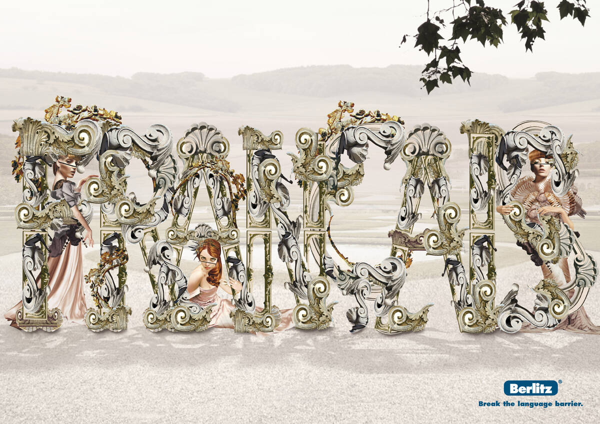
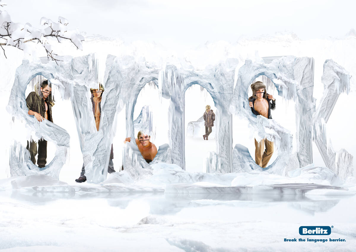
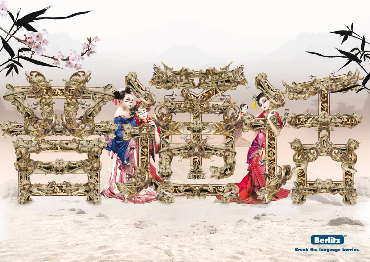
Incredible work...
Correct me if I'm wrong, but I think it's quite easy: If you learn the language - you break the barrier and get the girls ... but we have the best girls!!
Regards from Stockholm!
Agree with Fabian Kirner. The idea is kinda nice, but the art direction is not good, in all the ads!! Let's be objective people. The images don't come together, wrong perspective, light isn't correct either. Sorry, but it's half way.
Submitted by Fabian Kirner on Tue, 2008-04-15 10:51.
... ahem, I think you got me wrong. Actually I like that stuff!
Did you take a closer look to the illustrtators portfolio?
Check it out at luerzersarchive.com
Comments
Gorgeous and breathtaking Artdirection.
Yeah. Breath taking it is.
Very nice idea and art work!
Am I missing something?
--
brandon
www.brandonknowlden.com
Yeah, but that's the point – that you don't get what it says. That's so you'll need their product to 'break' the language barrier presented.
But seriously, do you have to show people literally 'locked-up' in the words?
ugh, wince, groan.
No better way to show language barrier? I'm thinking that (language barrier) sounds like pretty fertile ground.
breathtanking???? Sorry but the Artdirection in my optinion is weak and i don't get the idea, is there any?
I love the shades! Show!
Incredible work...
Correct me if I'm wrong, but I think it's quite easy: If you learn the language - you break the barrier and get the girls ... but we have the best girls!!
Regards from Stockholm!
@brandon: Brain cells, maybe ; )
Really nice work. Like that style of illustration.
Great idea.
Horrible art direction.
Everything looks like it was just pasted there.
Not that bad my old friends!!!
I´m glad to see you´re able to create great stuff even though I´ve left you! :-)
Keep on!
F
Agree with Fabian Kirner. The idea is kinda nice, but the art direction is not good, in all the ads!! Let's be objective people. The images don't come together, wrong perspective, light isn't correct either. Sorry, but it's half way.
... ahem, I think you got me wrong. Actually I like that stuff!
Did you take a closer look to the illustrtators portfolio?
Check it out at luerzersarchive.com
uhh did you know that not every single ad has to look that way?
Art direction is good but I just don't get how it breaks the language barrier.
You have to hate advertising in order to truly love it.
I like!
The Illustrators Portfolio
http://www.luerzersarchive.net/personalshowcase.asp?person=72695
Doesn't work for me, too much of a copy-paste look.
Post new comment