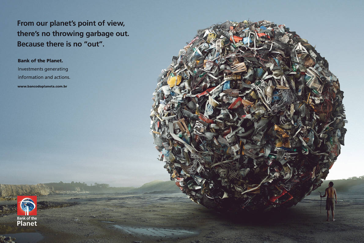
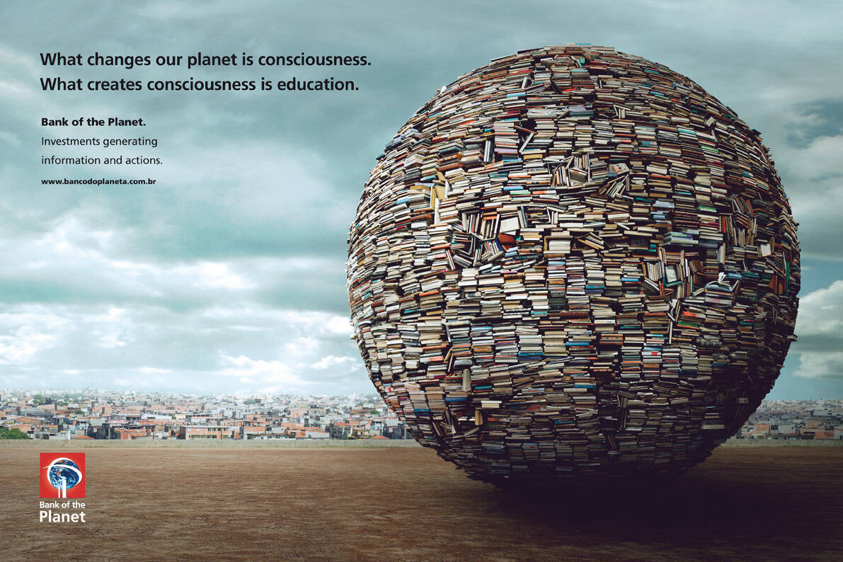
Ads of the World is a commercial advertising archive and community showcasing the best and most interesting creative work worldwide. More

We want your brains!Check out the AotW-R Creative Competition
Deadline extended till Dec 15!
Bank of the Planet. Investments generating information and actions.
Advertising Agency: Neogama/BBH, São Paulo, Brazil
Executive Creative Director / Creative Director / Copywriter: Alexandre Gama
Art Directors: Márcio Ribas, Cláudia Issa
Photographer: Paulo Vainer
Illustration 3D: Caio Montanari
Digital Retouch: Daniel Leão, Willian Teixeira
Comments
Really nice visuals
The Ad Mad
I like this campaign...Awesome visuals
All are great photoshop and in general is a touchy campaign. Is a common theme this days and I believe it takes advantage very well. I mean, it also seems that worked for the critics in here. Visuals are "done" as they use to say.
of course... since only 3% is drinkable water it would NEVER be called "Water". Since we can walk in it, thanks to the steady ground, it shall be called "Earth"...
These are all nicely done.
That said, I feel like there is a lack of an emotional value to them. The visual is good, the copy is clear but I still feel like they are all a bit "cold" and too factual. None of them struck an the emotional nerve like they should of.
This campaign is solid work. Some of the lines are a bit unpolished, but that has obviously more to do with translation difficulities than the actual concept. Well done.
i like it. it's awesome like a plane´!
ahem...
http://www.youtube.com/watch?v=C5rTJkfBhbQ
yeeeeaaaah... i see what your saying, but its using the sphere metaphor
in relation to our planets shape, not to tie in with the tag line like
with Travelers.
BTW the animators deserve props on the Travelers Spot, looks awesome!
Yeah this works alright.
Lines work fine, visual is nice too.
not bad!!
good copy
really good visuals !!!
Great Idea! I like
If only 3% is drinkable, isn't that a nice angle to create an ad?
aka conserve water :)
Post new comment