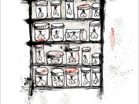
Ads of the World is an advertising archive and community. The archive showcases campaigns from around the world categorized and updated daily. In the forum you can discuss your professional life and post your work for critique. The blog features advertising stories. Read more
On Demand Videos
On Demand Videos: Video tutorials for advertising pros and designers providing tools and information you can trust — and use — on your very next project. Subscribe today!


Comments
looks like student work. by the way, the flowers and creepy shadows on the wall are really eye-iritating.
GOOD PHOTOGRPHY AND ART DIRECTION. WINNER CAMPAIGN.
Guess you work, or know someone who works, at Saatchi & Saatchi Dubai LION, eh?
Seems a little desperate to comment the same way on all the executions.
*schtick*
Especially using all CAPS. :/
:-)
*schtick*
I refuse to read anything in all caps. It hurts too much.
These are dark and eerie looking, not what you would expect for a detergent. I'm undecided on these.
Come back to the fields, elle
and we'll do our 'decide' dance...
>>>> That's not an ad. THIS is an ad.
That sounds like a plan.
I've decided that these ads don't need my approval or disapproval. They can simply be.
1 2 3 twirl... 1 2 3... hug... 1 2 3 spin... 1 2 3 dip!
>>>> That's not an ad. THIS is an ad.
Yeah, the background throughout campaign juz doesn't make any sense..iz like after shooting the 'kidnap' one, they decide to reuse the set for the rest..Funny thought juz art direction not helping it.
I like the Art Director's obvious and pathetic attempts to talk up his own work more than the work itself. But then, I'd enjoy stepping on rusty nails more than this work.
it's humorous. art direction is nice but seems a bit dark for a detergent. guess they were trying to make it stand out?
winner campaign? hahahahahah
work more, try harder my friend.................lolz
Post new comment