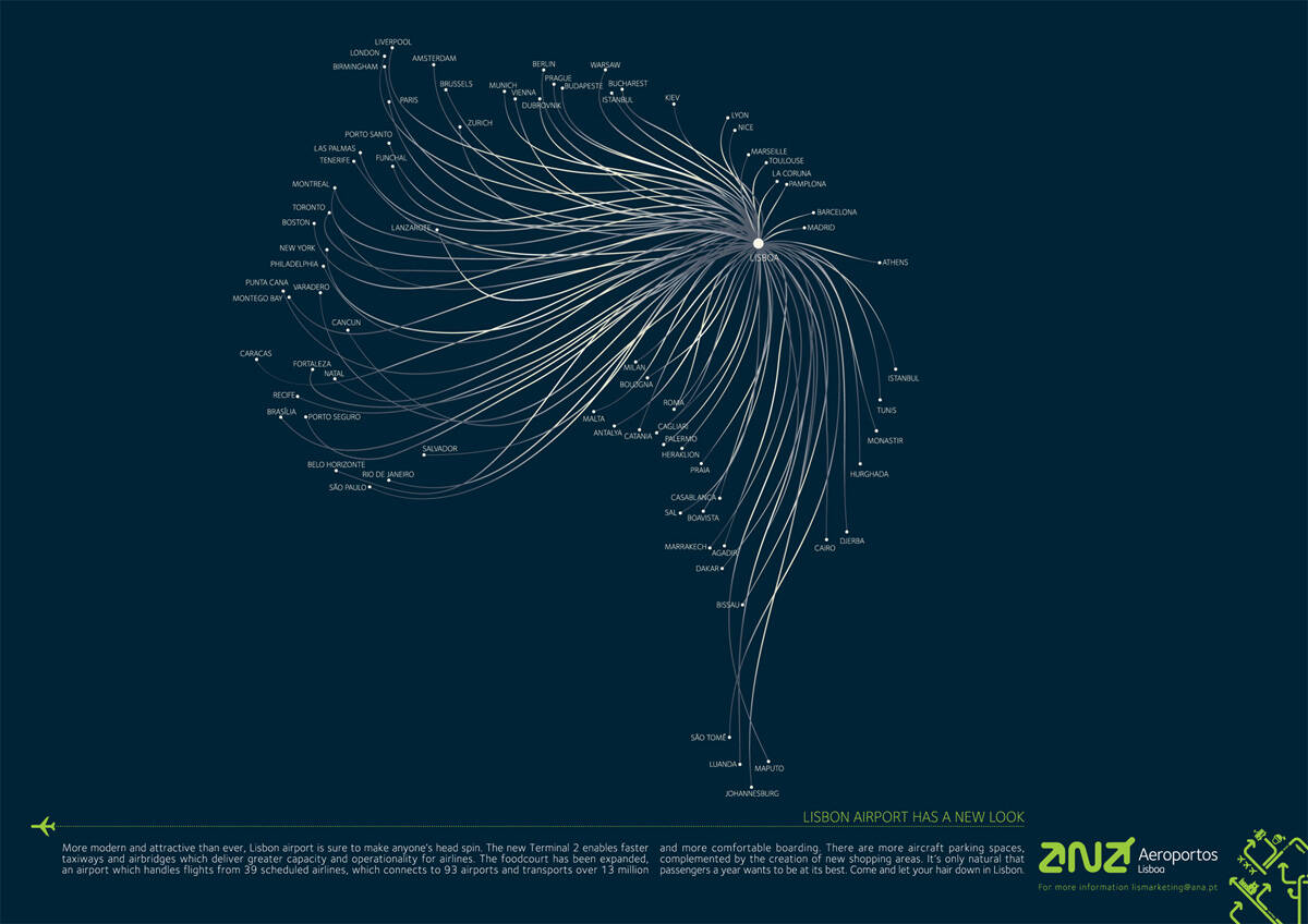
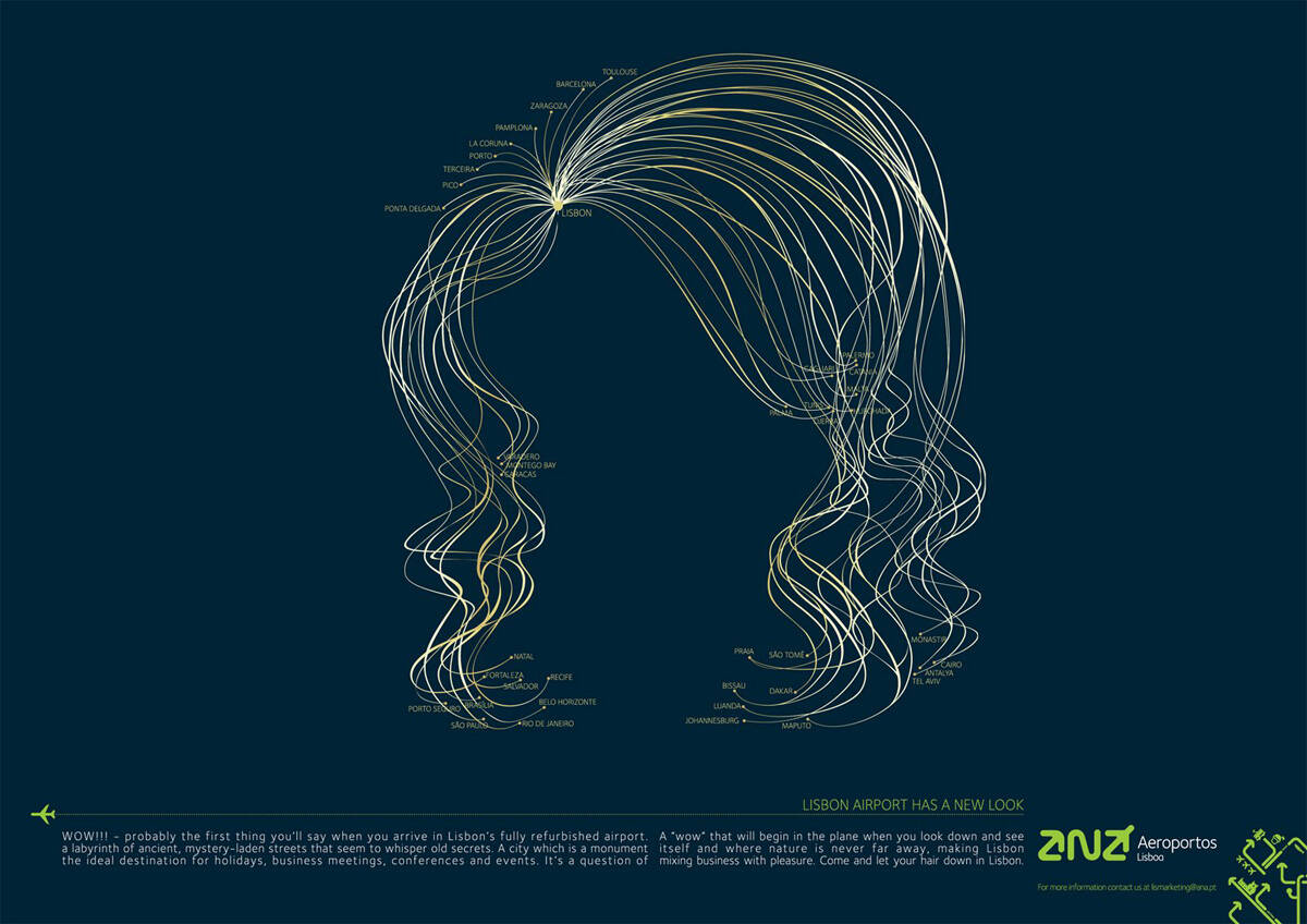
ANA Airports: Red
Lisbon Airport has a new look.
Advertising Agency: BBDO Portugal
Creative Directors: Marco Dias, Nuno Jerónimo
Art Director: Rita Ferreira
Copywriter: Augusto Barata
Chief Creative Officer: Pedro Bidarra
Published: July 2008
Lisbon Airport has a new look.
Advertising Agency: BBDO Portugal
Creative Directors: Marco Dias, Nuno Jerónimo
Art Director: Rita Ferreira
Copywriter: Augusto Barata
Chief Creative Officer: Pedro Bidarra
Published: July 2008
14 comments
is that hair?
love anything creative
http://addot.blogspot.com/
Infected by a virus called CREATIVE | "And ya I Love Everything"
http://addot.blogspot.com | http://creativecreepers.blogspot.com
i don't want to fly in a plane that can't keep the direction straight.
the copy is very weak, that "business and pleasure" crap making it very uninteresting. As if that was not enough, the formatting of the text is weird. Why do you have 2 blocks/ columns, if you don't want the reader to change the line once he or she reaches the center?
Could it be they left room for the gutter? That's the only thing I can think of. However, if they did, it's not much space.
agree, each one is very beautiful and a nice idea, but the curly ones missed the intention of the campaign i guess
Like it a lot. It's a brilliant ideia and it looks so simple.
Allistar, you must be new in the business, when text comes like this it's because it's double page. That gap i'ts where the magazine folds.
brilliant
-----
Others have seen what is and asked why. I have seen what could be and asked why not.
Pablo Picasso
Great idea, very simple and clear.
Works for me.
SALVA.
www.juansalvarredy.com
http://www.containerone.info
http://thelift.tv/spain
AWESOME
ABSOLUTELY GENIAL. WHY DIDN'T I SEE IT AT CANNES? DOESN'T SEEM LIKE A GHOST.
I think this is very good on the brief everyday work. no clever scams here
Simple and clear, I like it.
Love the concept.
GOOD WORK
: )