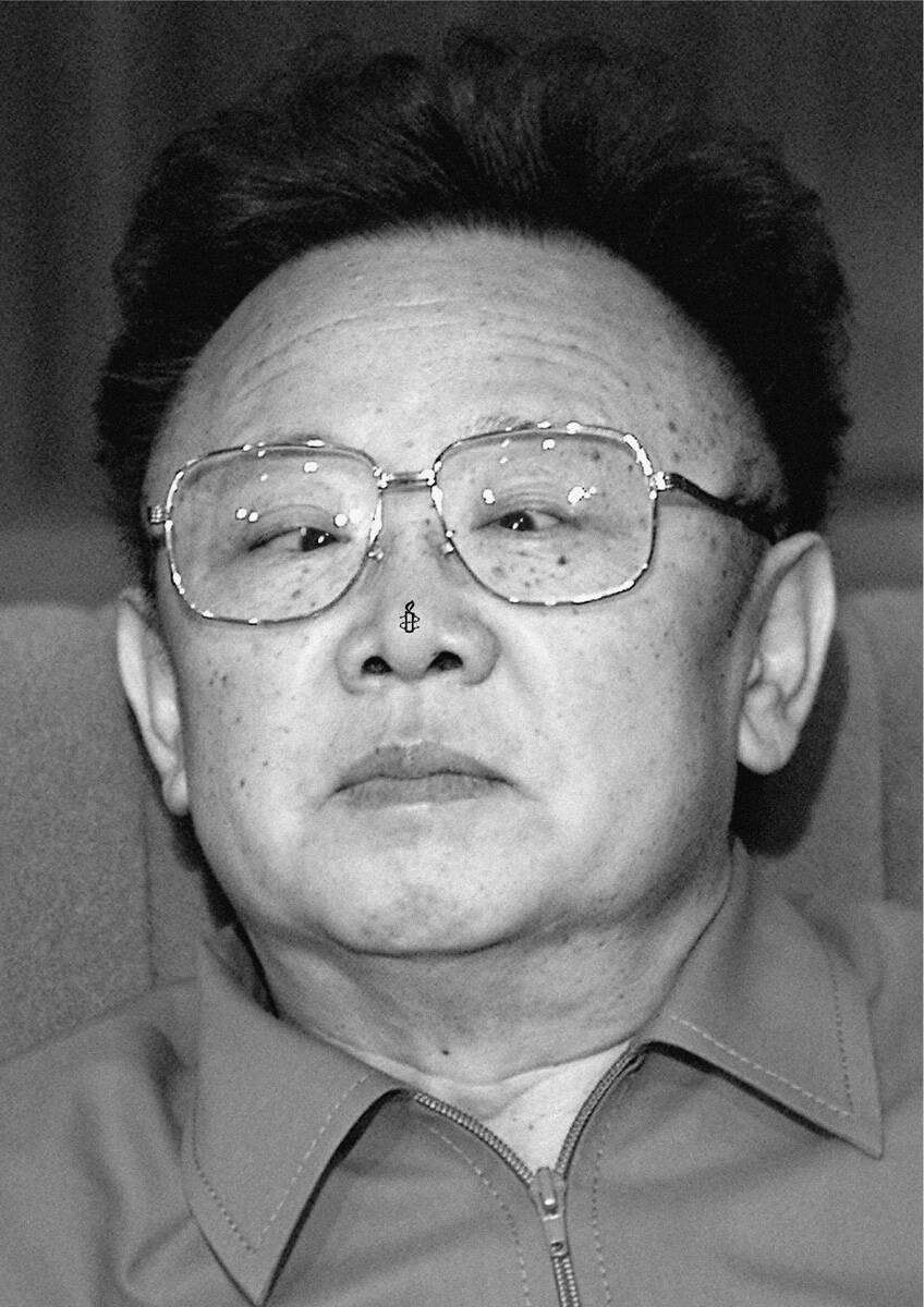
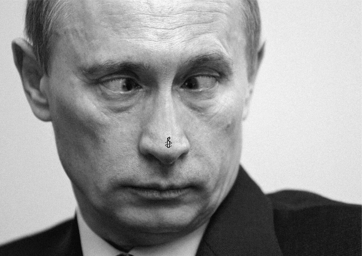
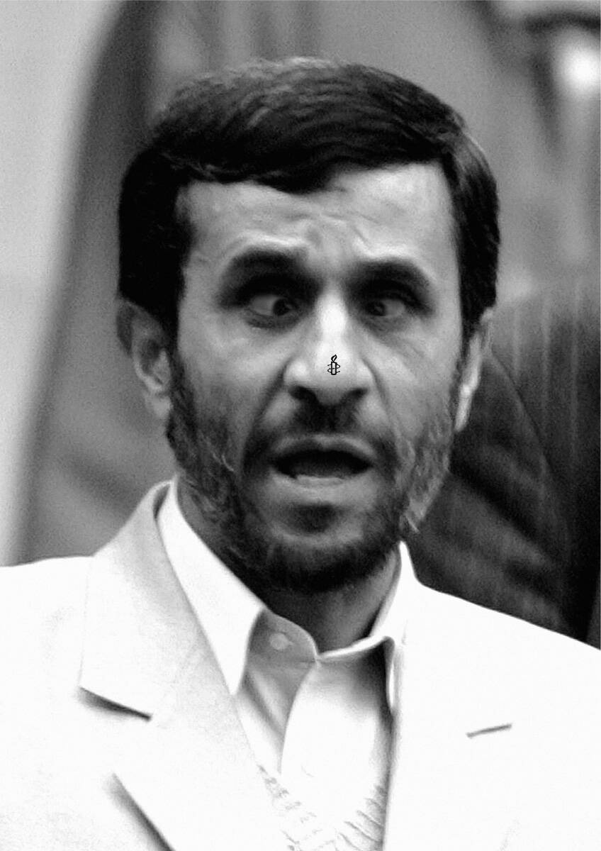
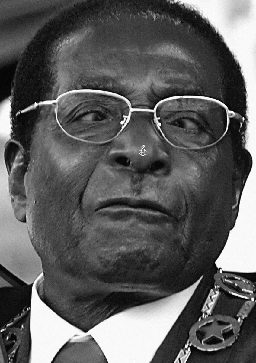
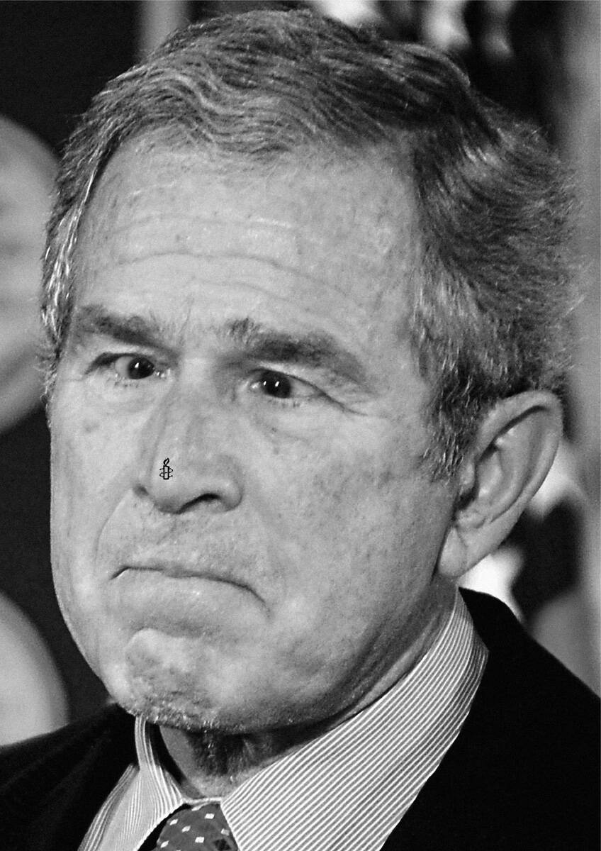
Amnesty International: Hu Jintao

Amnesty International: Hu Jintao

Advertising Agency: Contrapunto, Madrid, Spain
Creative Directors: Antonio Montero, Carlos Jorge, Felix del Valle
Art Director: Carlos Jorge
Copywriter: Felix del Valle
Published: January 2008

Your rating: None Average: 5.8 (8 votes)

Comments

Perfect.

This is Gold
(or should be)

Felicidades Contrapunto!

very very very good

Rekker's picture

Belgium 2007!

http://www.mm.be/nl/cotm.php?id=1490&page=7

Say no more...

Nice work!

Apologies for my cultural ignorance (I'm not from the US so I have no excuse) but who is this dude?

Apologies, he is the Chinese leader. I knew that... duhhhhh

they talk about people who have grudges as those who "have flies on their noses"...

Ok so Amnesty International is like a fly for these hard ass dictators... just an annoying fly.

I prefer the one with the firms closing their mouths... this is no gold...

I think that's a wrong interpretation of the ad, it's not about an annoying fly or whatever.

We were discussing this campaign for a bit here at the agency and our interpretations are the following:

1. Do this exercise: put a tiny piece of paper on the tip of your nose and then cross your eyes to try and see it. You can't :) No matter how hard you try. So that can be one interpretation...these idiots pictured here keep ignoring something that's right in front of them.

2. Might just be that these idiots pictured here are only worried about their noses, in the sense that they don't care about anything else other than their interests. So the creatives for this campaign placed the Amnesty International logo on their noses :)

Anyway, no matter what interpretation, these are fabulous.

This is from Spain.

In Spain we have the expression "Mosca Cojonera", wich can be translated like "Annoying Fly" or "Stone inside the shoe" if you prefer.
It's used about an independent person who doesn't follow blindly the guidelines of the power because he thinks is unfair and tries to do
what he considers the rigth think. We use it for judges, pacifists, dissidents...etc (A pain in the ass for the power)

It works perfect in this country for this brand.
I don't know outside.

so u think audience will understand the result of ur brainstorming session?

look at the panadol one is enough ad. that ad did not photoshop to make people look bad,
that's superb idea that carry itself without trying so hard to make people look bad.
enough saying i guess, people who know my message will not need me to explain further.

criticize is way easier than create. use more brain.

I like it.

pmoniz

the 2nd interpretation is the right one.
and i did not like the camapign.

heh

I like the simplicity of it. A picture and a logo. But there's nothing other than that. Where's the idea? A solid strategy perhaps.

Still with fly or without it... no gold... nothing here.

mondo's picture

it's simple & funny. it's very good!!

The_Fat_But_Funny_Spiderman's picture

ºLº
FELICIDADES CONTRAPOINT POR ESTE CAMPAÑON, LLEVO UN PAR DE DÍAS PENSANDO ¿PORQUE NO SE ME HABRÁ OCURRIDO ANTES? ;)

IDEAS POWER!!! AUNQUE CREO QUE ESTO LO HE VISTO EN OTRA CAMPAÑA (EL MISMO RECURSO Y LA MISMA BAJADA)

Lu*

www.danielglezmilan.blogspot.com

PERFECTO FELIX,CARLOS.
GRAAAAAN CAMPAÑA.

SALUDOS DESDE MÉXICO.

¿tiene algo de malo inspirarse?

http://www.hnabooks.com/images/products/9/1558-23.jpg

entra y di lo que piensas en...

the-martinez.blogspot.com

Post new comment

The content of this field is kept private and will not be shown publicly.
  • Allowed HTML tags: <a> <em> <strong> <cite> <code> <ul> <ol> <li> <dl> <dt> <dd> <blockquote> <img>
  • Lines and paragraphs break automatically.
  • Web page addresses and e-mail addresses turn into links automatically.

More information about formatting options