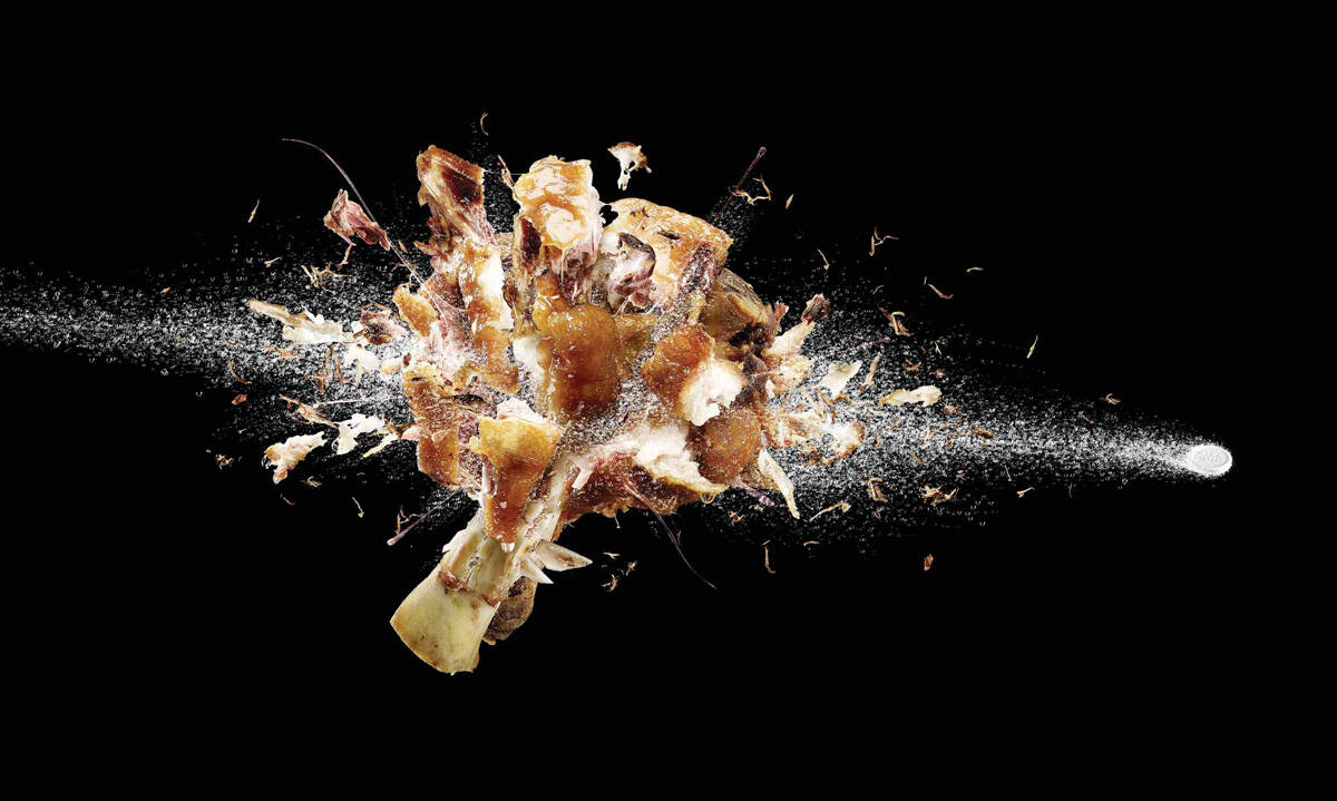
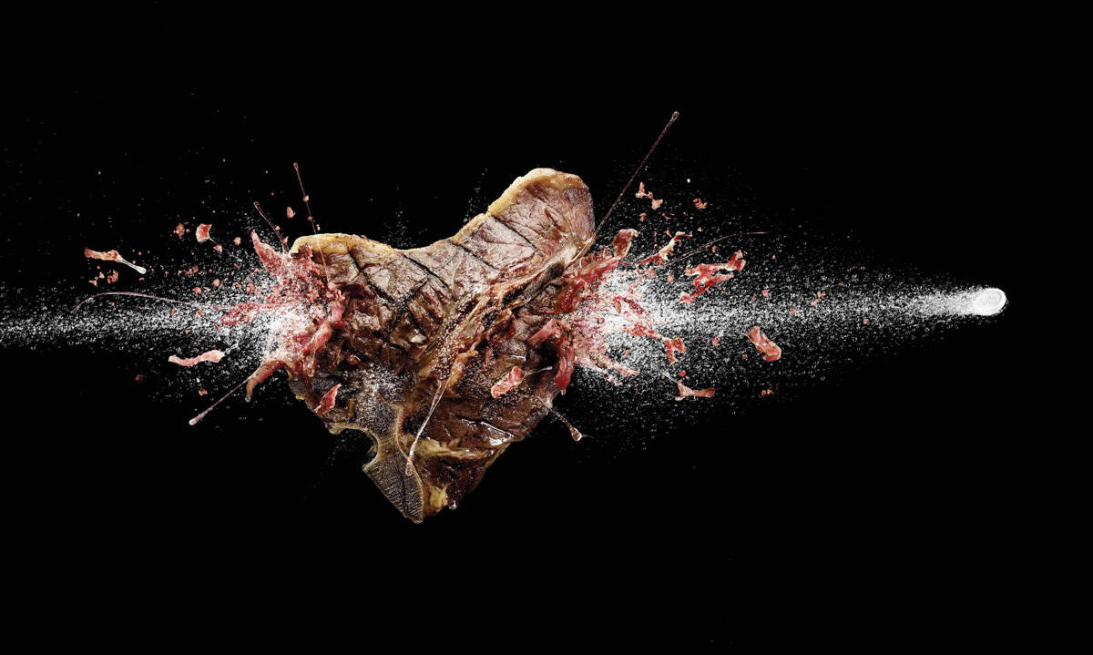
Ads of the World

Ads of the World™ an All Creative World site

Alka Seltzer: Pork

Alka Seltzer: Pork
Your rating: None Average: 7.3 (28 votes)

Advertising Agency: BBDO Bangkok, Thailand
Chief Creative Officer: Suthisak Sucharittanonta
Creative Director / Copywriter: Subun Khow
Art Director: Supparat Thepparat
Photographer: Remix Studio Bangkok
Retoucher: Remix Studio Bangkok
Copywriter: Kongpope Siriwattanagarn

51 Comments

Zeus's picture 916 pencils

Definitely a gold winner

moisescho's picture 184 pencils

too dam excellent.

himanshu prabhakar's picture 470 pencils

good

Himanshu Prabhakar

talkingisfree's picture 1677 pencils

BOOM!!!!! LOVE IT!

ChuckNorris's picture 836 pencils

Thai creatives are CRAZY!

Really like it, but dare I say this: Maybe the logo should be a bit bigger.

sumsum's picture 619 pencils

cannes

Vicomte's picture 287 pencils

THIS IS GREAT!!! See you in Cannes

BOOBJOB LOOBCANNON's picture 1866 pencils

how would you know it was alka seltzer?

We're going to need more lube.

TrainRunner's picture 225 pencils

good point.

elgrecones's picture 323 pencils

it is written on it...

BOOBJOB LOOBCANNON's picture 1866 pencils

I can't see it on mine, even when I 'make it big'

I agree its a nice idea though.

A wee pack shot in the corner would make it better.

We're going to need more lube.

Kateter's picture 2040 pencils

agree. and that's the only thing i don't like here.

but still - boombastic ads!

BozzaNova's picture 45 pencils

[In my humble opinions]

Sometimes I wonder what's so wrong with logo or packshot.
Why do most of the art directors hate it so much?
Isn't it our job to serve a client(brand)?

Well, I'm from Thailand, and I know (not in person) this ECD.
He's one of the best creative in Thailand nowadays. I admire him a lot.
This work of his is, again, a very nice campaign.
But without recognising the product, does the ad do its job?
If you make the name on the pill bigger, or even put the logo (doesen't have to be so big - if you hate it so much) on the ad, will that spoil the whole ad that much?
I believe not... It's still a great ad anyway.
On the other hand, making the like this makes me feel, somehow, a bit bad to the ad.
I feel like it doesn't serve its objective.
So, maybe, instead of 10/10 (if the product/brand is more recognisable), I'd give it just 9.5/10.

Jet Propulsion Lab's picture 10719 pencils

I gotta believe there actually WAS a logo or even a package shot on the page originally, but they took it out just for the purpose of submitting the ad to this website. Just to make it look a little more "dramatic."
The graphic imagery of the tablet and the bubbles has always been their trademark, so the recognition value is definitely there. But no sane client should ever run their advertising without a logo or tagline or if it's a packaged goods, a simple product shot. (Unless it's supposed to be a teaser ad.) It's just too risky a proposition.

I do like the work here, though. But the more I look at it, the more I want to see their little logo in the corner somewhere...

LeeHarvey's picture 3085 pencils

As you can tell by reading all comments the majority agrees with you, JPL, and so do I. Adding that nice lil' logo does not make the ad less creative, yet more understandable. Great 'shots' btw.

JamurPutih's picture 265 pencils

agree. ad should sells!

end of joy, enjoy

chinaski's picture 919 pencils

Cannes.

Pogi5's picture 253 pencils

Terrific Stuff!

Wordnerd's picture 6575 pencils

wow, awesome!

everartz's picture 7251 pencils

cannes material...
--
Everartz

| Everartz |

calderon's picture 22 pencils

Felicitaciones que buen concepto y una gráfica impecable.

m í t i c o's picture 676 pencils

Lo que realmente impresiona es el retoque digital.

teenie's picture 1906 pencils

Aw, come on, guys! All that and no product shot???????? Tell me the original that went to print had at least a line with Alka-Seltzer somewhere. I mean--clients may whine but some whine with good reason!!!!!!

Lovely, lovely visual. Fantastic eye catcher. Lovely insight. But it's not an ad if you're not selling the PRODUCT. We're not artists, people. We're advertisers.

Weezard's picture 50 pencils

Mate, you said it all. Well done

otto54's picture 381 pencils

Bravissimi.

----------------------------
Advertising pass, pasta remain...

gabrielrodz's picture 50 pencils

DONE!

Puerto Rico 2005
Ergo Communications
Client: Wrigley's Eclipse

Won Silver and Gold "CÚSPIDE" Local advertising prizes. Didn't win in Cannes. I don't think it made it to the shortlist.
You can see it here:

http://www.festivalcuspide.com/presentaciones.aspx

Go to: Cúspide 2005 - Young & Rubicam PR / MEDIOS NO PRIMARIOS (2nd top to bottom 2nd row) / keep clicking until you reach number 36/37 and 69/70.

mrtalented's picture 2175 pencils

de ja vu. same idea but way better art directed. better photography and retouching too.

don't think this creative team has seen that print campaign before. let's see how cannes judges think.

Vonz's picture 23 pencils

OH GOD! It's true, the same idea!

but_why's picture 282 pencils

Couldn't see the link but I don't think it works anyway - it's clever and eyecatching but it looks really violent and I don't think people want to associate that with the effects of Alka Seltza.

gargamelord's picture 32 pencils

DONE DONE DONE DONE DONE DONE!!!!!

IN PUERTO RICO 2K5

john doe's picture 1575 pencils

coincidence? hopefully...

robot-rock's picture 813 pencils

simplisimo y clarisimo. jaja esta chevre.

[ http://eltubedeyou.blogspot.com ]

BozzaNova's picture 45 pencils

I think it's a different idea for Wrigley's... but the same visual execution.
And in my humble opinions, it works better with the benefit of this Alka Seltzer. (And maybe that's why the Wrigley's one didn't even make a shortlist for Cannes.)

strmkid's picture 35 pencils

great idea, except I had no idea what that was at first. You might want to ad a logo...or at least make the alka seltzer wording on the pill stand out more.

wildbore's picture 753 pencils

superb!

ndoz poerba's picture 2 pencils

extremely boombastic ad..LOVE IT!!

-ndoz-

the killer's picture 1488 pencils

nice idea.

your work is your identity.
http://harshikcreations.blogspot.com/

khalsain's picture 222 pencils

great visual...where is the product id????

krautland's picture 3180 pencils

fucking hell, this is awesome.
I had to look to the title to figure out the client but hey, the idea is brilliant.

All ears's picture 233 pencils

What it for?

petek's picture 1894 pencils

Great, if there was a logo to tell me who is advertising ...

poojagadodia's picture 194 pencils
BFB's picture 922 pencils

Didn't bother reading the other million comments, I love it!!

sold's picture 2618 pencils

GREAT STUFF, GREAT PRODUCTION.
but, as we can see on that link in gabrielrodz comment: DONE.

so, if cannes judges give an award for this idea we can start to search on the long and short list of cannes this year and remake some ideas with better production to gain lions next year.

i dont believe the team knew the original campaing...

BOOBJOB LOOBCANNON's picture 1866 pencils

I like to think it was probably just a coincidence on gabrielrodz link.

We're going to need more lube.

A to the G's picture 63 pencils
BOOBJOB LOOBCANNON's picture 1866 pencils

That's a bit tenuous.

We're going to need more lube.

mlsman5000's picture 128 pencils

there was a series of food processing ads done exactly the same a few years back

Kateter's picture 2040 pencils

link? source? brand? agency? award?

Fridgerator's picture 458 pencils

Nice. To the point.

----------------------------------------------
The concept is only as good as the execution.

Jetstream's picture 115 pencils

Really nice idea and beautiful execution.

Ads of the World advertising archive and community showcases fresh creative campaigns daily from around the world. Read more

Recommend us on Google