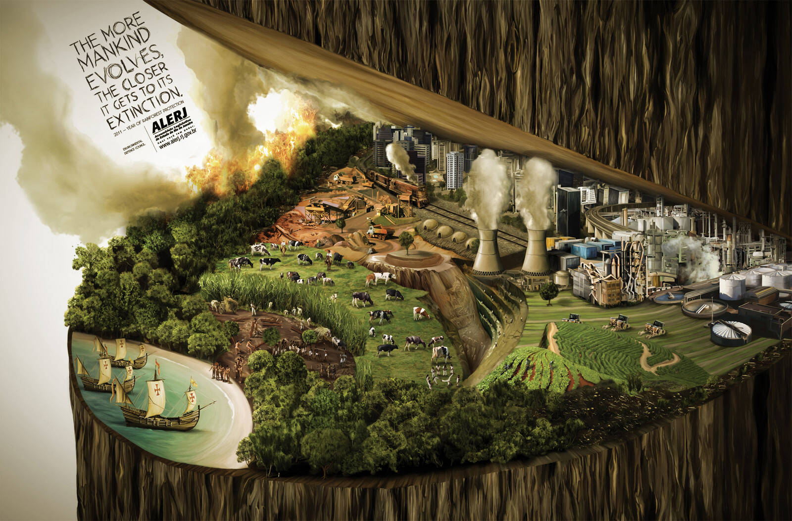
Alerj: Rainforest protection
The more mankind evolves, the closer it gets its extinction. 2011 - year of rainforest protection.
Advertising Agency: Staff, Rio de Janeiro, Brazil
Creative Director: Paulo Castro
Head of Art: Bernardo Machado
Art Directors: Felipe Menezes, Henrique Parada
Copywriter: Maicon Silveira
Illustrator: Otávio Rios
Published: November 2011


23 Comments
nice idea, terrible execution! come one. I expect much more. don't bring down the standards of your country.
Dirty art direction.
Gorgeous illustration. I find the flow of information strange.
Outstanding execution. Very original look and feel. Love the Art Direction.
Well, as long as the tree doesn't fall towards us, mankind should be fine.
The line has a nice enough thought in it, but the visual doesn't work at all.
what a bad illustration...
nice illustration
It's not so bad.
http://www.mandarinoadv.com
i ag ree with big mac....then it would have been naaaice
busy.
Ummm, the fact that the tree could fall IS the idea.
Neat illustration. However, it could have been much better. At the end, good job.
Dharmesh Padia
Bad execution
Idea: 5
The more mankind PROGRESSES - not evolves...
Nice art, copy needs polish.
THERE'S NO HEAVIER BURDEN THAN A GREAT POTENTIAL
Very strong!
What hath God wrought
strong idea and execution. also, christanity caused everything? just asking:)
is it half cooked or half uncooked? its half uncooked!
The copy as well as the design works for me.
http://isitamoonoraballoon.blogspot.com
It's a wondeful work !
It shows cleaning what the mankind did and are doing nowadays !
Congrulations for the brazilian, in just one picture, you were able to show the world.
The art direction isn't doing the idea justice.
Our trees will going to die, if we say stop. It is so clean. Nice illustration.
I like it, but it is sort of confusing at first because the rainforest is intact by the seashore.
However if you look at this historically, with the tall ships to the south west and the landscape becoming increasingly destroyed the further north you go then it does make sense.
I fail to see why you think the art is so bad, I think it is quite wonderful.
SJackson
The illustration is rather nice. Clean/cartoon effect noted, regardless..very nice. The composition is a problem, and as mentioned the copy is off.
Silver? Really? I am fairly new here and with the idea of the site, I'd like to stick around and be involved..., but I don't go for public/popularity vote based judging. It's basically invalid on all levels. ...I would love to see the rest of the contestants.
So, as I said...the composition and oval shape give subliminal signals and a juxtaposition of a weak image, surrendering...besides it looking like a toilet bowl. Sorry I had to bring that up, but psychologically speaking...think about it....The only reference the mind has of this shape is a bowl with lid.
Simply tilting this illustration would strengthen it...You don't have to be litteral with the concept/falling tree etc. that message is clear.