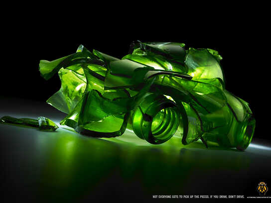
Aflodef: Camouflage, 3
Some realities are ignored but if you look them closer you can see it.
Advertising Agency: Marcca Comunicacao, Florianapolis, Brazil
Creative Director: Alemao Rodrigues
Art Director: Marcello Storino
Copywriter: Joao Claudio Lins
Illustrator: Marcello Storino
Retouching: Kado Digital Art
Published: June 2009


24 Comments
really nice
mrckais
Same visual done last year, by BETC Euro RSCG Paris...
cool campaign... terrible copy
one of copywriting's and copywriters' day that they can forget for good.
otherwise there will be some serious problem...
it's word-wise HEDIOUS!
they showed me a picture & i laughed
dignity has never been photographed
Dude where the hell did you learn to write?
If you're going to insult a writer for their skills at least do it right.
sometimes happens that italy arrive first :-))
just done for terres des hommes italy
in the 2007.
"terres des hommes"? shouldn't be terra degli uomini? if it's in Italy...
Hormone vs Neuron - Twitter
:-) yes, just like the apple computer in italy is mela computer...i hope you're joking.
great
very nice. Trihan
Does it have a typo in the copy? Where is the "at"?
Impressive idea. Moinid
Alexander Bickov - Freelance web designer | Twitter | Facebook | Creative ideas
Done...
http://api.ning.com/files/GeKtsznyskc3CXpGnPTLvprErdTaCanwzPeIx3*K18I-...
http://api.ning.com/files/GeKtsznyskcg-3E4J9K*99Ff4WSrzd4TYkYZuaxii*UM...
http://api.ning.com/files/GeKtsznyskceM7MQD1obqpHV5YXLQp1*zp*3XNaZNr8V...
oh oh!!
Copy is aiding the visual too much.
that's not a copy. it's a manual for the ad :P
Also done
nice~~
good illustration
-------------------------------------------------------------------
~ Quite obviously, I have gathered no moss ! ~
Done. Done. Done.
How have you been, man?
Hi... I really didn't know about this ad. Although the arts look similar, purpose and concept are not the same. I saw many ads using the same graphical features. But this special fact does not make them equal.
For example, see this:
http://adsoftheworld.com/media/print/nokia_nseries_with_gps_rescuedisa...
and this:
http://www.flickr.com/photos/criztto/3800717611/in/photostream/
What’s the difference between them? Purpose, concept and creative idea. Do you know what I mean? Well, I believe in coincidences.
Thank a lot for your comments.
M.Storino
Very strong image! The image and copy convey a consistent message. Well done. Guest | Mon, 2009-08-10 13:31 is right though. There's an "at" missing.
I dream of a day when chickens will be able to cross the road without being questioned regarding their intentions.
Yes done for "fighting crimes" but it is stronger for this particular call.
Paralyzed people suffer from social neglect much more than crimes.
Art is nice - copy and logo on patch is well done.
Copy is very prosaic.
another camouflage ad, yawn
doesnt fit with the organization