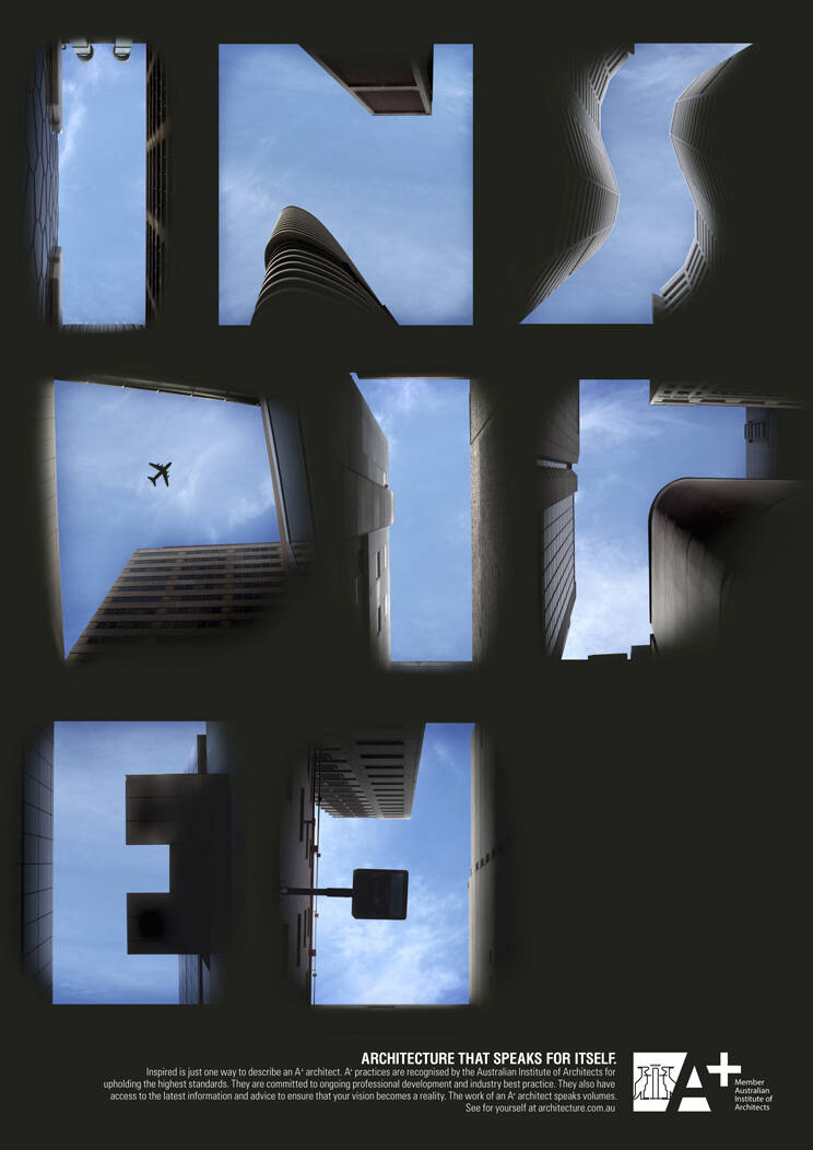
A+ Architects: Unparalleled
Architecture that speaks for itself.
Unparalleled is just one way to describe an A+ architect. A+ practices are recognized by the Australian Institute of Architects for upholding the highest standards. They are committed to ongoing professional development and industry best practice. They also have access to the latest information and advice to ensure that your vision becomes a reality. The work of an A+ architect speaks volumes. See for yourself at architecture.com.au
Advertising Agency: CHE Melbourne, Australia
Account managers: Suzy Leys, Mark Forward
Photographer: Matt Harvey, Willem Du Toit
Retoucher: Malcolm Stark
Executive Creative Director: Jason Ross
Art Director: Josh Murrell
Copywriter: Sharon Condy
Producers: Robyn Mitchell, Connie Leonne, Loreta Zaruski


7 Comments
When you creating a new type face or font design, you have to be sure if you are going to write Letter (A) or any Letter from A to Z, graphically it should be same, the reason why I'm writing this, its really obvious as you all can see in the ad.
www.praxisadvertising.com
«Photographer: Matt Harvey, Willem Du Toit»
?!!!
http://www.lisarienermann.com/
Similar works with these photos already were at a Mercedes-Benz and Renault:
http://strange-way.livejournal.com/83922.html
looks a little crammed for space...
www.wordsofbabel.blogspot.com
no comprendo. don't understand.
This is difficult to read
Done by Mercedes Benz & Renault
new thing....looks good