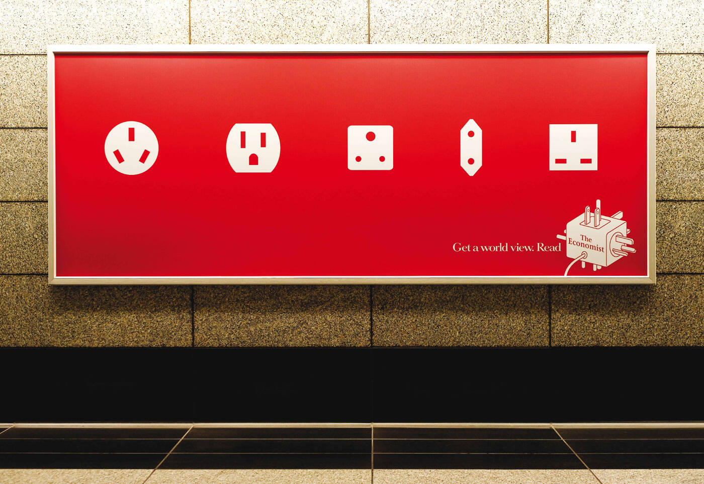
Ads of the World a mediabistro site

The Economist: Plugs

The Economist: Plugs
Your rating: None Average: 6.5 (53 votes)

Get a world view. Read The Economist.

Advertising Agency: BBDO, New York, USA
Chief Creative Officers: David Lubars, Bill Bruce
Senior Creative Director: Kara Goodrich
Senior Creative Director / Writer: Pierre Lipton
Senior Creative Director / Art Director: James Clunie
Illustrator: Nick Dewar

Comments

Guest's picture
10

shit. this is awesome. classic economist

Guest's picture

awesome.

sirvan's picture 9360 pencils

This is a [sic] disconnect for the Economist. Their ads have really fallen short lately. …I mean, at least try and tie it back to Technology Quarterly or SOMETHING.

+++

"I love everything"

Guest's picture

You misused (sic), ellipses, and your profile pic. And you're wrong. This is pretty darn good.

Guest's picture

really i thought the [sic] was used to alleviate the pun; the ellipses has actually taken to an evolution in modern grammatical terms, causing it's use to be prescribed to more fluent use throughout a written piece -- providing a the same metaphorical "readers pause" as the semicolon; and the ad is crap, lose the strapline and maybe it would gain a little wit but barely

I really should be working's picture 2 pencils

(sic) or [sic] the brackets are unimportant. 'Sic' is from Latin and should be used either before or after a quote where the spelling or grammatical structure is incorrect showing that the person quoting is aware of the mistake in the quote, whereas the person being quoted was not.

Guest's picture

I see a big personality mismatch.
Although both share common traits such as providing a universal function which allow users to gain power, the soul of The Economist has been totally robbed here. It feels to me The Economist has just passed away... becoming colourless, lossing its wits, intelligence and ability to connecting with our inner self. Like the universal plug, The Econmist has become a commodity without a brand identity. That, I feel, was the most powerful essence own by the brand.

Guest's picture

the economist "has passed away"? i don't know that i agree with that. BBDO did some pretty nice stuff last year.

cathlim's picture 7 pencils
1

I see a big personality mismatch.
Although both share common traits such as providing a universal function which allow users to gain power, the soul of The Economist has been totally robbed here. It feels to me The Economist has just passed away... becoming colourless, lossing its wits, intelligence and ability to connecting with our inner self. Like the universal plug, The Econmist has become a commodity without a brand identity. That, I feel, was the most powerful essence own by the brand.

Guest's picture

You no speak good.

sirvan's picture 9360 pencils

You mention "power", which is another way they could've brought this idea around so it actually had something to do with the Economist (to which I subscribe).

The way this is executed, however, it's a big, fat ad FAIL.

Why? Well, for the "great!" Guests out there, unlike the great Economist work of the past, this ad fails to pass that 'ol ad test: could you put another logo on this ad?

Could this ad be for another product? Of course you could.

In this case, you could easily put the name of any travel magazine and not gain, or lose, anything. You could even put Newseek's or another "worldly" magazine's name on it, and it would be just as bad.

And that's a problem.

+++

"I love everything"

Guest's picture

ah, spoken like an ad student with one class under his belt. try this little test. take the great economist board that showed the lightbulb lighting up every time somebody walked underneath it. could that have been for any one of a hundred magazines that make you smarter? a university? yep it could. but the economist did it and that's why it will be a great ECONOMIST ad.

Guest's picture

i always knew al sharpton was a blowhard fool

Guest's picture

Agreed. Since when are the "get a world view" and the universal plug necessary? The Economist ads used to demand some thinking, looks like they decided to be less inteligent now. Sad.

ilovegreatads's picture 282 pencils

The array of sockets - very HSBC of the early-mid 2000s. Where's the intelligent verbal wit that made The Economist's advertising so inspiring to us all? Why this dumbing down into elementary visual grammar?

Guest's picture

Regarding the disconnect and/or mismatch with previous "The Economist" works, you all seem to be missing the obvious.
This is done for a US audience. And I'm sure in the US edition they've replaced articles with comics and notices with splashes.

Guest's picture
1

The Economist should be ashamed. No wit. No intelligence. A weak visual gag for the idiot generation.

Guest's picture

Surprised you didn't get it then!

everartz's picture 6042 pencils

nice!

| Everartz |

Guest's picture
9

very very cool!

Guest's picture
8

me likey!

shahidali's picture 1694 pencils

i get some hsbc flavor. just remove the economist logo and put the hsbc, no one will even ask you an explanation.

also, the product (economist) is 'specialized' and the ad attracts the 'generalized'. isn't it a contradiction developing from a lack of understanding the TG?

shahid

Vargais's picture 163 pencils
7

good one

Life is a joke. Laugh.

Guest's picture
10

great!

Guest's picture
6

Why all the hypercritical overanalysis. It's good! Better than most crud out there.

www.jackmancer.com's picture 1839 pencils

simply great!

sirvan's picture 9360 pencils
1

All this says is "travel the world" or "be worldly"… it says NOTHING about being worldly AND economically savvy. Which is what the Economist is about.

+++

"I love everything"

Guest's picture

Why does it feel like you don't like subscribe to above mentioned publication.

Guest's picture
8

economically savvy?! do you think the economist is about being economically savvy?! it's not. you're a putz.

Guest's picture

No, he's not. Sorry guys, but we demand more from The Economist ads... They spoiled us into expecting something very, very smart. This ad is not on the same league.

Guest's picture

Great if this was done 15 years ago.

Guest's picture
9

good on ya bbdo. nice n simple. i dig it

dlue's picture 279 pencils
1

what is this? is this like economist lite? I though economist stood for smart and wit, not forced visuals for the sake of it. If the campaign has lost steam someone needs to have the cojones to say so and evolve it. It had a good run but if work like this is all that's left maybe it's time to move on; sad showing

cheers,
dlue

Guest's picture
9

great. i think these haters are missing the point. its simple and smart. what exactly is not to like about this board?

Guest's picture

it's not smart. and i don't think it's possible to miss the point in this ad and that's the problem

Guest's picture

David Lubars once agreed: "we are animals".

CurryJ's picture 841 pencils

All I can say is I agree with Sirvan... in a nutshell, this is so far away from the classic economist branding that gave them the edge...

================================================
ideas-schmideas. Deadlines-schmeadlines

ibeg2differ's picture 443 pencils

The Economist has built up a reputation so great, that no matter what they now, people will say it's good. Just because it's the Economist.
This ad is just 'ok' by the way.

Guest's picture

Seems to me it's working the other way.

Guest's picture
10

or they bash for the same reason

everartz's picture 6042 pencils
4

wow! so many comments here.. i suggest you guys to go and read the economist instead XD
oh! i dropped this comment here just to earn 3 points :D

| Everartz |

Guest's picture

if the art director had a world perspective, then he would know that the Australian socket is upside down

punk's picture 87 pencils

Lol... Exactly.

Done!

Guest's picture

actually, sometimes they look like this and sometimes its the other way. there is no upside-down

Guest's picture
1

really?

hagemony's picture 333 pencils

hahaha....good advice everatz!

rits's picture 38 pencils

yup,gud!!

Guest's picture
9

this is pretty cool. i saw it in a seattle bus station, and it really stood out. economist rulz

Ace Le's picture 354 pencils
3

Agreed with sirvan. This creative is kind of lazy and too simple as compared to their previous ones.

"Everyone advertises products. Everyone directs creatives. Everyone services accounts."
http://www.linkedin.com/in/acele | http://www.youtube.com/ace85 | http://www.facebook.com/ace85le | http://ace85le.livejournal.com | http://twitter.com/ace85le

Guest's picture

I think this is sweet

rolling.stone's picture 2120 pencils

simplicity has a different virtue, what this ad has

-------------------------------------------------------------------

~ Quite obviously, I have gathered no moss ! ~

Guest's picture

I think this as is really good in it's own right. I mean different countries have different plug point usage. Only an idiot will call this dumb.. its quite good.

tanvir hassan raju's picture 423 pencils

Another Economist masterpiece.....!

tanvir

second_creator's picture 596 pencils

ya i agree wid tanvir

copywriter
mumbai
Early to bed, early to rise, work like hell and advertise

dlue's picture 279 pencils

seems to be a lot of boot licking lol....

cheers,
dlue

Ads of the World is an advertising archive and community. The archive showcases campaigns from around the world categorized and updated daily. In the forum you can discuss your professional life and post your work for critique. The blog features advertising stories. Read more

On Demand Videos

Social Media and the Customer: Focus on Community Management
How community management can drive great customer service and transform your business. watch a preview

On Demand Videos: Video tutorials for advertising pros and designers providing tools and information you can trust — and use — on your very next project. Subscribe today!

stocklogos.com logoawards.mediabistro.com