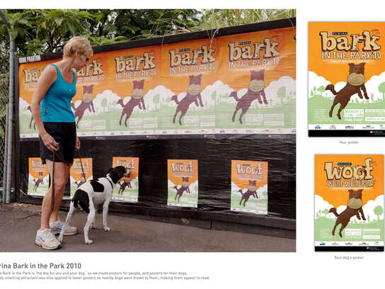
Tambour: Babies
Advertising Agency: Shalmor Avnon Amichay/Y&R Interactive Tel Aviv, Israel
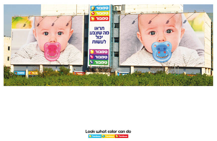
Chief Creative Officer: Gideon Amichay
Executive Creative Director: Nir Livni
Art Director: Sagi Blumberg
Copywriter: Yaron Perel
Executive Client Director: Tal Fishbain
Account Supervisor: Yael Yuz
Account Manager: Liron Ben Yakov
Planning: Yehoram Davidi


14 Comments
don,t get it .what's the product and what's the difference?
blue is for boys, pink is for girls
They are paint manufacturers but what is the message?!
"it soothes, who cares about the color"?!
withalltherespects
"Look what color can do"
Not much obviously. Two boring babies. So what?
This is a complete snooze.
So what? that's the question
good idea, but wrong execution. because of the different expressions and positioning of the kid in the photos, it seems like two different kids, rather than like one kid seem in two different ways. may have been better if they'd used the same photo for both.
Double yawn...
Too much waste of space for nothing
pufffffff boring!
personally i think the idea has a stroke of genius somewhere in there...... deep in there..... are they advertising paint?
I don't think that is so hard to get. Only the color of the pacifier is different, and because of this tiny little difference you perceive one as a boy, the other as a girl. It is another the-power-of-colors / color-changes-everything ad.
Yes but the photos aren't the same...
Agree, that was a bad decision.