


Description
Editor: Andrea MacArthur
Visual Effects: Method
Re-Mix Studio Engineer: Jason Wormer
Sound Design
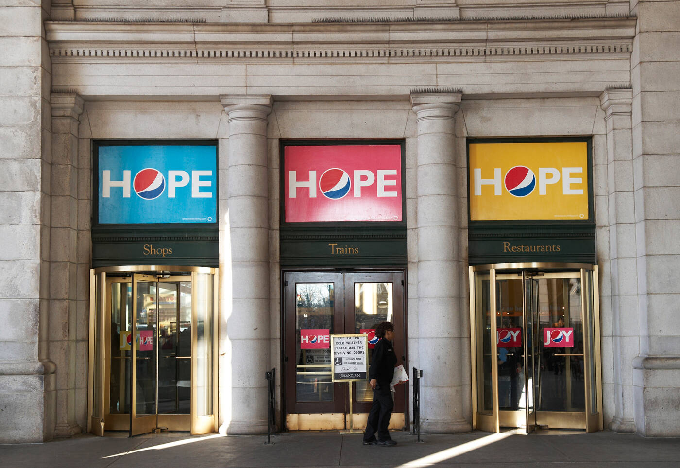
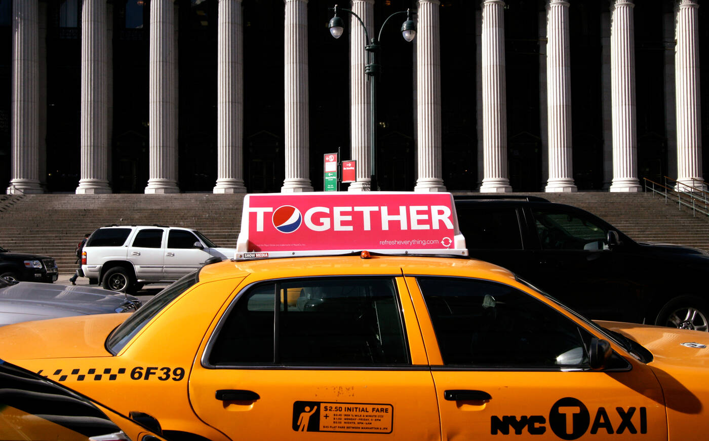
This professional campaign titled 'Pass, Yes you can, Taxi, Oh Boy, Howdy, Hope, Hooray' was published in United States in January, 2009. It was created for the brand: Pepsi, by ad agency: TBWA. This Film medium campaign is related to the Drinks (Non Alcoholic) industry and contains 7 media assets. It was submitted over 17 years ago.
Credits
Advertising Agency: TBWA\CHIAT\DAY, USA
Worldwide Chief Creative Officer: Lee Clow
Executive Creative Director: Rob Schwartz
Creative Directors: Brett Craig, Joe Shands
Art Director: Xanthe Hohalek
Copywriters: Melissa Pipeling, Michelle Lewis
Head of Production: Richard O’Neill
Executive Producer / Agency Producer: Anh-Thu Le
Associate Producer: Chris Capretto
Account Management: David Dreyer, Romy Flint
Production Company: MJZ
Director: Dante Ariola
Director of Photography: Matthew Libatique
Line Producer: Natalie Hill
Editorial: Peepshow
Assistant Editor: Healy Snow
Executive Producer: Helen Hughes
Producer: Scott Boyajan
Creative Director: Alex Frisch
VFX
Set Supervisor: Gil Baron
CG Supervisor: Andy Boyd
Lead Compositors: Claus Hansen, Alex Frisch
Compositor: Noah Caddis
Music: The Who “My Generation”
Re-Mix Music Producer: T-Bone Burnett
Re-Mix Musical Arranger: Darrell Leonard
Sound Designer: Brian Emrich
Telecine: Company 3
Colorist: Stefan Sonnenfeld
Mixing Facility: Play
Mixer: John Bolen