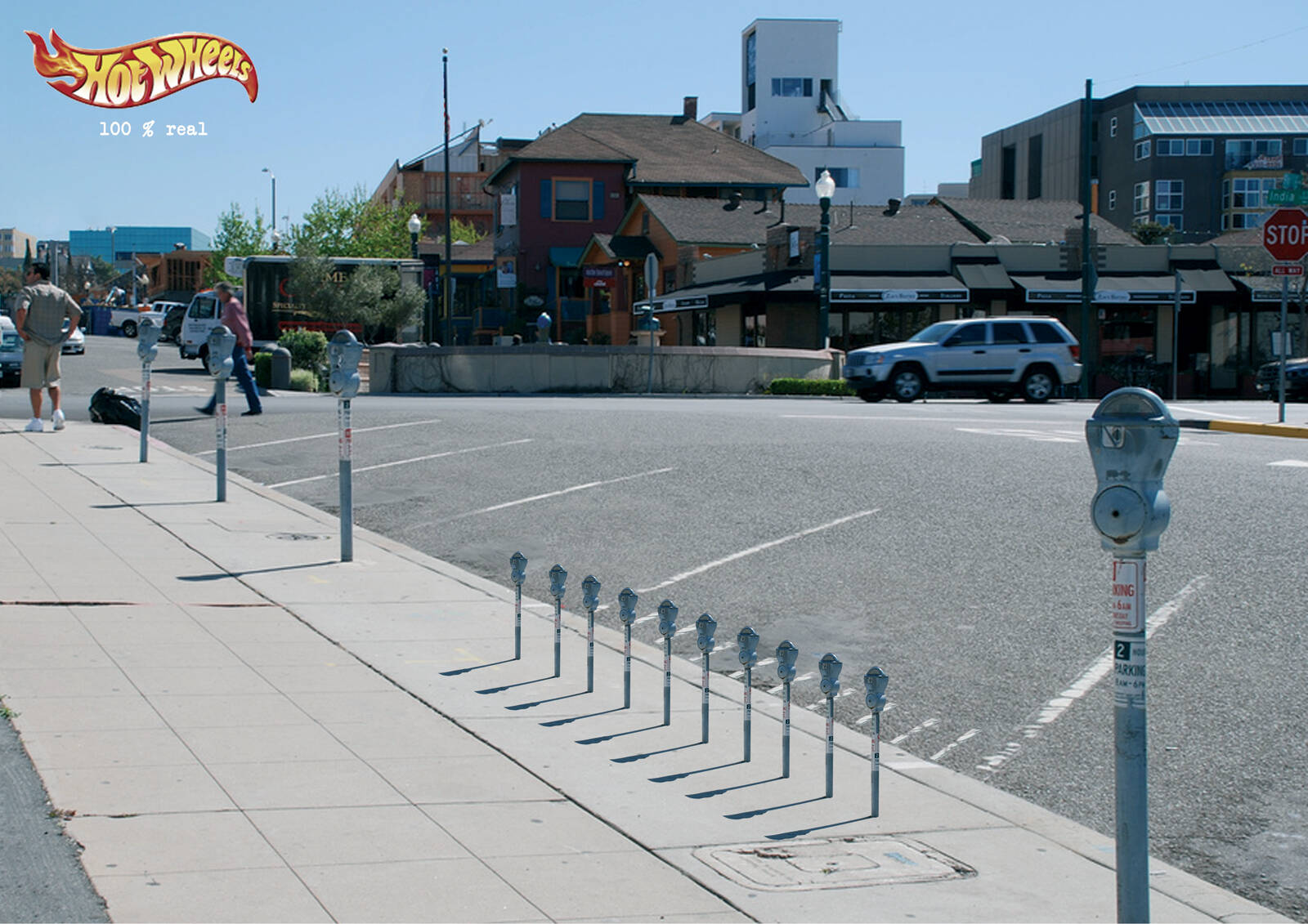
Ads of the World is an advertising archive and community. The archive showcases campaigns from around the world categorized and updated daily. In the forum you can discuss your professional life and post your work for critique. The blog features advertising stories. Read more
On Demand Videos
On Demand Videos: Video tutorials for advertising pros and designers providing tools and information you can trust — and use — on your very next project. Subscribe today!


Comments
first idea.
first idea? and so? the first idea can be right? :|
GTFO.
Lame. Might be better as ambient. Poor picture for an ad.
nothing unexpected....
first photoshop lesson: copy and paste
one should not take life so seriously - as one will not come out of it alive.
With the shadows going in the wrong direction. Amateurish
I'm not a big fan of Hot Wheels and Matchbox adverts, but I kind of like this one.
So I guess I'm just weird. ;)
Ok, I know that there are people always claiming Photoshop disaster... but this one has merit. The ad is clever enough. However, when you copy and paste something and then make it smaller, be sure to blur the newly pasted object a little and add some grain. That way it looks like it was in the original photo... Not a more in-focus higher resolution miniature.
You still missed the main error.. as I have said earlier, wrong shadows, never mind the blurr
Es un trabajo de un alumno de universidad???? porque el retoque esta pésimo y la idea es muy débil.
Se nota que es de una agencia pequeña, ya que no filtran bien las piezas que suben.
Es un trabajo de un alumno de universidad???? porque el retoque esta pésimo y la idea es muy débil.
Se nota que es de una agencia pequeña, ya que no filtran bien las piezas que suben.
100% scam
El concepto de la marca en todo el mundo tiene que ver con la velocidad y no con realidad. Raro
no, hot wheels vende autos reales.
para formar un criterio hay que analizar.
Think it for a while.
Then, in anytime, it will come to your mind as an idea.
El concepto de la marca en todo el mundo tiene que ver con la velocidad y no con realidad. Raro
Terrible art direction, I´m a Junior It looks like a sticker pasted on a photo...
Terrible dirección de arte. Soy una Junior eso se ve como un sticker pegado sobre una foto.
DnicGarcia
DIrector de arte primerizo, sin duda fue su primer aviso hecho en photoshop...
Director creativo primerizo también, le falta muchas vueltas, la primera idea puede ser buena pero no es la mas efectiva no eficaz para la marca.
NO
Yes, everyone can tell it's a fake, but I really like the creative on this one.
That said, the spray-painted parking spot ad has hit it's prime, had a few kids along the way and is ready for retirement... Hopefully sooner than later.
Kaleb Leija
good idea. the lighting on the little ones is off. they're to bright
cuec!!
no one mentioned the scale is totally wrong? hot wheels fit in the palm of your hand.
totally. thought it was an ad for like a Go Kart ride or something.
For once i agree with this weird community.
Lose the headline...still works without it, me thinks.
================================================
I'm not always right; I'm just never wrong
shame it's not an ambient in front of a toystore. as print it's kinda lame for me
how unexpected ;)
you suck men you and your ad,
We are students. Thanks for your opinions :)
buen intento
Para ser estudiantes me parece muy muy fresco. Enhorabuena
Gracias por las reseñas, como estudiantes es un honor!!!!
http://avisoscampeones.wordpress.com/category/agencia/zink-project/
http://www.stillad.com/hot-wheels-parking-2667.html
http://www.sostav.ru/news/2009/03/12/zar1/
http://www.ra-info.ru/2009/03/12/o-tom-kak-nuzhno-parkovat-hot-wheels....
Estaremos enseñando el portfolio por España en breve y estamos abiertos a cualquier oferta.
Nuestro email: cdmc1979@gmail.com
Si vale que bueno los links, en realidad crees que eso mide tu dirección de arte.....? es más es cuestión de criterio, y usar ese tipo de fuente tan old school, por el amor a dios, te ayudo www.dafont.com. Y por lo menos ten la dignidad de bajarte el logo en una mejor resolución, si quieres te ayudo, de nuevo... www.brandsoftheworld.com. Hasta cuando el bevel and emboss....? Photoshop de segundo semestre de diseño.
PATÉTICA DIRECCIÓN DE ARTE.... que lastima. Sigue practicando www.psdtuts.com
PS: No considero que seas estudiante, pero si debes aprender de tus errores, no seas tan mal perdedor y date cuenta, detalla tu pieza y quiero que seas más critico... consideras que esta bien...? te fijas que todo esta borroso y tu súper montaje no....? Me vale madres si esta posteado hasta en cannes... es ESPANTOSA y DEPRIMENTE tu dirección de arte. y el Copy....? Que genialidad... 100 % unreal.
great idea.
andrea cotrim
www.andreacotrim.com
The big idea is what counts. It's what separates the CD's from the photoshop programmers.
Post new comment