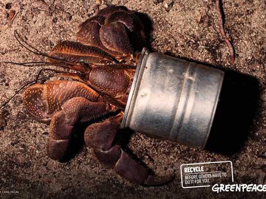
Greenpeace: Shoe, 2

Greenpeace: Shoe, 2

Advertising Agency: McCann Erickson, Madrid, Spain
Executive Creative Director: Leandro Raposo
Creative Directors: Mónica Moro, Pablo Sticker, Pablo Colonnese
Copywriters: Javier Wandosell, Juan Carlos Salas
Art Director: Javier Wandosell
Photographer: Gonzalo Puertas
Art Buyer: Juan Pacheco
Account Supervisors: Gregorio Corrochano, Angeles Porcel

Your rating: None Average: 6.3 (12 votes)

Comments

good one but better will be put there thumbtack (drawing-pin) !

Best Greenpeace ad ever seen,
9/10

if it didn't said greenpiece on the title, i could never read it on the pebble, and that just ruins the entire work :(

does that mean you wear snakes and then a pebble hits your foot like the snake bites you? quite funny :)

does that mean you wear snakes and then a pebble hits your foot like the snake bites you? quite funny :)

the message is really nice!
it take me a lot of time to find it, but rocks!

|Some of my best friends are softwares|

Unless I'm much mistaken, the idea is that Greenpeace are the annoying pebble in the shoe of this sort of fashion.

This may also be the only ad in history where the client is justified in saying "make the logo bigger".

Jupiter's picture

this ad tells me: "you can't handle a big logo!"...so here's a small one... go get your greenpeace magnifying glass quick!!!

over-and-out!

charming approach.
nice shoes.

"the art director says: whatever I say"

it's exactly the same idea like these amnesty fly-logo-on-the-nose-of-dictators-stuff-shit-bla!
http://adsoftheworld.com/media/print/amnesty_international_kim_jong_il

Just shake your shoe and the peeble is gone. Is that so easy to get rid of Greenpeace???

Sigh.

It's an expression. Pebble in shoe. Spanner in works. Gremlin in system.

Honestly, for an ad-related site, some people are literal-minded fuckers.

Javier and Juan... nice work.

SUPERB!!

I'm with Desally

hillbilee.com

shatty art direction + inspired idea = BADVERTISEMENT!

Genius. Deserved more than bronze.

Ravages's picture

I am not a fan of Greenpeace, or the other alarmists. But this is a hugely entertaining, clever ad. Good work.

C
--
http://cc-portfolio.blogspot.com
http://www.selectiveamnesia.org
http://www.flickr.com/photos/ravages

very good idea hindered by the layout. needs a better photo and a zoom on the pebble, cause it's difficult to read.

adi_in's picture

yep. most people will definitely miss the pebble and lose the message.

They will stop people in their tracks, the wriong-doers. But its too much to get. And the payoff isn't good enough.

Strip. Strip. Strip.