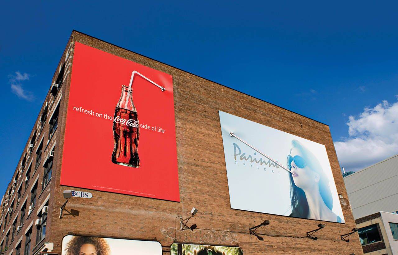
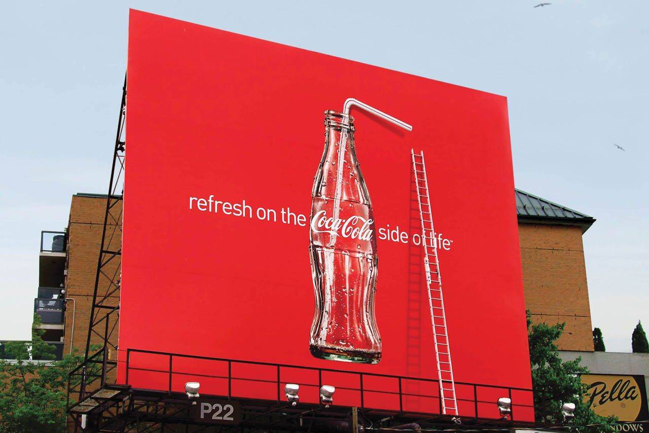
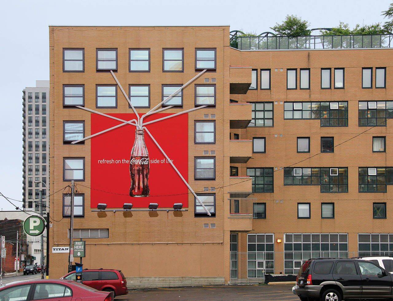
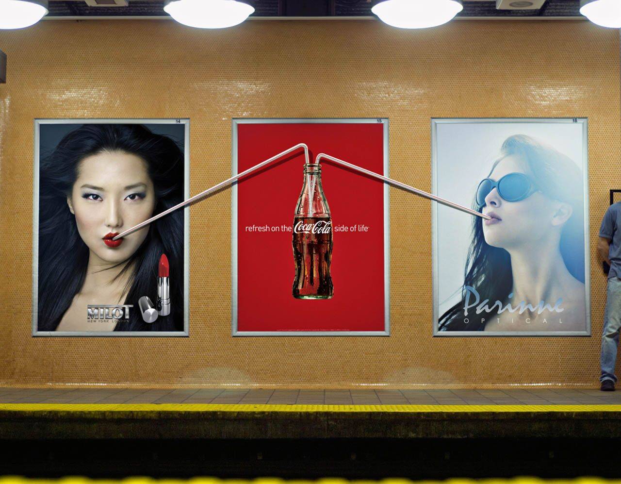
Coca-Cola: Straw, Windows
Refresh on the Coca-Cola side of life.
Advertising Agency: MacLaren McCann, Toronto, Canada
Creative Director: Sean Davison
Art Director: Robert Kingston
Copywriters: Wade Hesson, Nancy Crimi
Photographer: Frank Hoedl
Refresh on the Coca-Cola side of life.
Advertising Agency: MacLaren McCann, Toronto, Canada
Creative Director: Sean Davison
Art Director: Robert Kingston
Copywriters: Wade Hesson, Nancy Crimi
Photographer: Frank Hoedl
32 comments
hehe, :)
Everybody is creative, be yourself.
Love the idea but this doesn't look real?
Indeed, it seems photoshopped. A pity.
As an idea, it's fantastic.
it's not photoshop. it's a banner hung on the building. you can see the edges and where they hung it
Always try to be unique even when forced to conform.
Outdoor at its very best!
Great ;p products like Coke can be so difficult to promote as there isn't really much difference between them but what a great outdoor this is ;p
http://jackmancer.com/
http://twitter.com/jackmancer/
One coke, seven straws. Coke got expensive. Anyway, great work.
I like the look of it, but I thought something negative as well. I asked myself why it takes seven people to finish a bottle of coke. Maybe there is a reason behind it.
I know that I love orange soda and would not mind keeping it to myself. However, I am aware of Coke's "open happiness" slogan so maybe one wants to share that joy with others. Regardless, it is a good outdoor execution.
Better than the 'ladder' billboard.
Will Think for Salary
I disagree, the one with the ladder is funny too, in fact I like the whole campaign! Nice and simple, no twitter/facebook/augmented reality/online game rubbish, great to see just a clean billboard with a bottle and a straw nowadays... Must be gettin' old.
Clever, funny
Nice but forced.
sweet
www.crackerjackworks.com
FAKE!!!! FAKE!!
There are thousands of people who see this on the internet. How can you say it is fake?
I like it. It's really simple, everybody understands and works well for a leading brand like Coca-Cola. No complicated strategy bullshit, just the truth about the product.
Photoshop.... it's obvious.
Nice idea, its fake?
www.yoshirosans.blogspot.com
LOL FUNNY AND GREAT
Great idea.
Fab Idea!. A great idea is still a great idea, even if it is not for real.
Cheers guys
Real or not, it could have been a nice idea if actually done. *sigh*
It would be better with one straw, so that you get the immediate read that some sly dog is up there sipping the Coke he's not supposed to be, rather than that there's an insectoid community draw in progress. In other words: Overdone -- notch it back a little.
"Ubi hubave lubearned thubat ubanuby fubool cuban wrubite uba bubad ubad, bubut thubat ubit tubakes uba rubeal gubenubiubus tubo kubeep hubis hubands uboff uba gubood ubone."
-Lubeo Buburnubett
This looks very boring & what u are saying sounds interesting...it wud have looked interesting with just one straw, here there r so many of them & that too badly photoshoped.
Done before by McCann Erickson Istanbul:
http://farm4.static.flickr.com/3314/3670926789_66e6753358_o.jpg
Check the shadow on your billboard lights dude...
talkn abt d concept...itz really great..!!!
Awesome!
nice! but i have seen it before
No se acerca ni a los talones del corderito de chofitol. Dejen de mentir.
I don't lie coca cola. Gives you desease. But ad is nice.
This one and ladder is good. Other two are done to death.
Nothing better than well executed Media Arts.
twitter.com/thatcliffguy