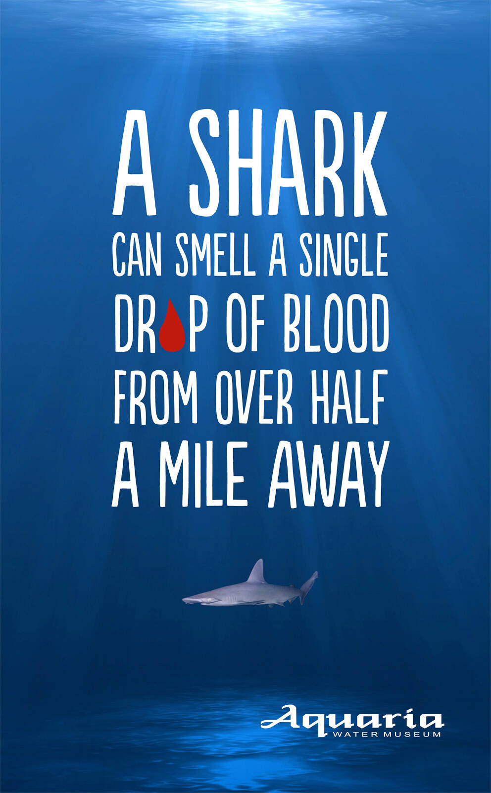
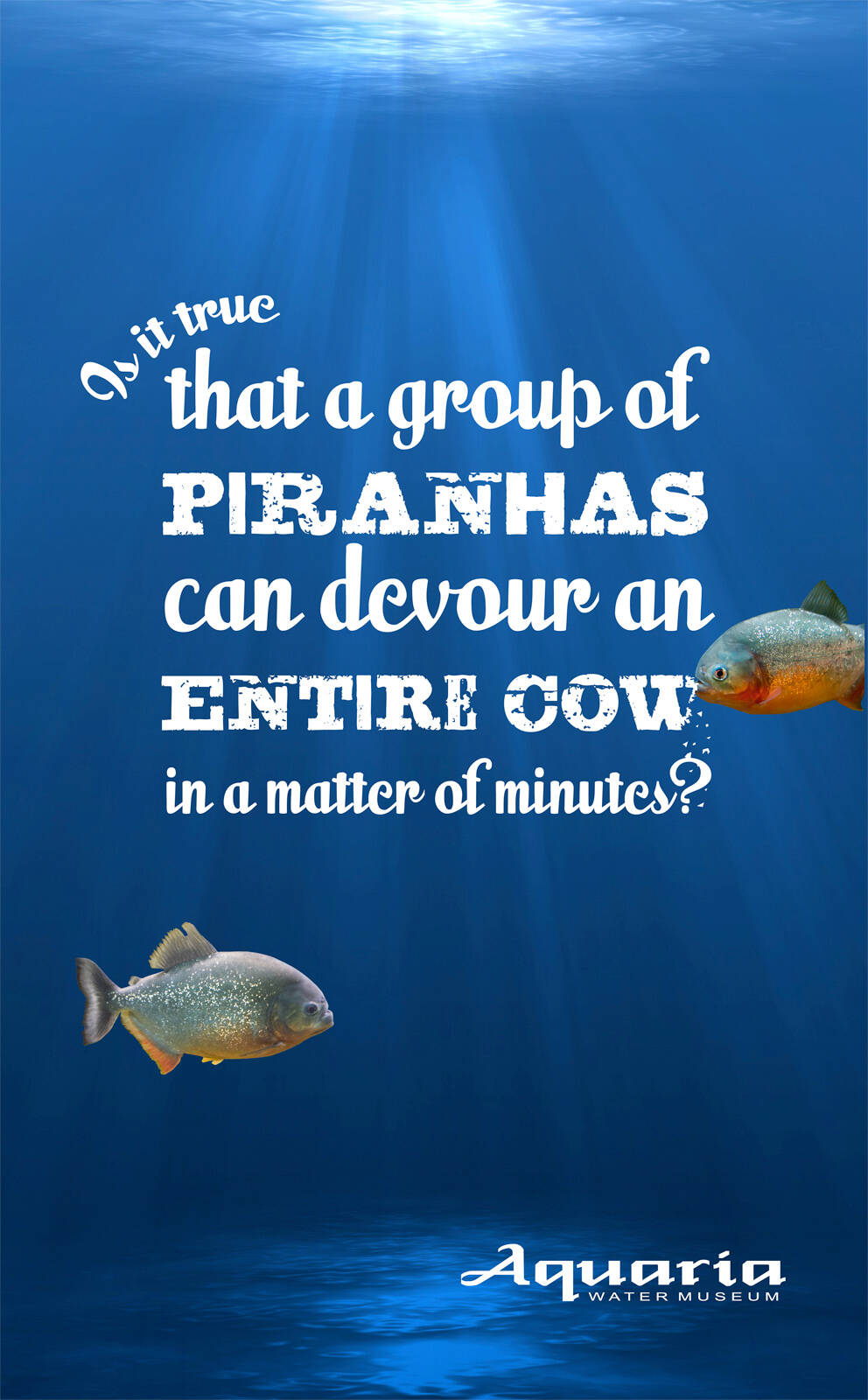
13 comments

incoming's picture
91 pencils
incoming

Also good, but why that red drop, I feel that was an easy way out. Their could have been a selection of type to represent, a drop rather than actually illustrating it. But once again I like the ad, but could have maybe been push a little further.

salil.sharma's picture
2028 pencils
salil.sharma

i love this one

nepotiums's picture
235 pencils
nepotiums

I agree!

killazol1's picture
354 pencils
killazol1

em... ok... i think.

monte kelos's picture
205 pencils
monte kelos

nice.

bembridge's picture
72 pencils
bembridge

Really like this campaign. Visually strong. Arresting and informative headlines. made me want to go see this Aquaria!

Gary Bembridge: Marketing & Travel Blogger, Podcaster and Consultant
http://www.tipsfortravellers.com http://www.twitter.com/garybembridge

sangan3's picture
6 pencils
sangan3

What's creative about stating some already known facts?

sangan3's picture
6 pencils
sangan3

What's creative about stating some already known facts?

incoming's picture
91 pencils
incoming

The creativity comes from the layout in the typeface presented, its placement, and the given tone of each word, and letter form presented

adgoodie's picture
172 pencils
adgoodie

Your visual is flat. Your copy is flat. For all we know, this ad could've been created by an account person.

Fernando Fernandes's picture
1372 pencils
Fernando Fernandes

Além do que os seu olhos podem ver!!

MicheleVirgilio's picture
2631 pencils
MicheleVirgilio

good simple art

kalra kieth's picture
141 pencils
kalra kieth

nice.