Ads of the World

Ads of the World™ an All Creative World site

McDonald's: Fresh salad billboard

McDonald's: Fresh salad billboard
Your rating: None Average: 4.8 (23 votes)

Watch the salad grow over the weeks.
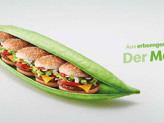
Advertising Agency: Leo Burnett Chicago Illinois, USA
Global Chief Creative Officer: Mark Tutssel
Chief Creative Officer: John Condon
EVP/Creative Group Head: John Montgomery
Creative Directors: V. Cook, G. Fox-Robertson, B. Shembeda, A. Gross

14 Comments

A.G. Pennypacker's picture 615 pencils

Hasn't this exact ad been done for this exact client?

ivan's picture
getconnected2001's picture 999 pencils

Its not bad if you carry on an Idea from one ad to another as long as its differently executed. is it?

Steviec's picture 126 pencils

This is quite old now. You've probably seen it on another blog.

R. Rinaldi's picture 686 pencils

Yum, yum, yum.

Jet Propulsion Lab's picture 10719 pencils

A textbook example of what not to do for an outdoor billboard. Very poor art direction. Green on gray background??? If you squint your eyes, those words almost completely disappear (yet, you can still see those two cars on the VW billboard far behind it.)

kc_brock's picture 705 pencils

how often do you squint when you look at billboards. wtfd?

rd

Jet Propulsion Lab's picture 10719 pencils

That's a trick I learned from a very well-known creative director when I was still an art director working on a billboard assignment for United Airlines. Many (trained) art directors still do it to test color contrast and its legibility under different light conditions before releasing the mechanicals to vendors.
There's even an industry-standard test (the name escapes me right now) for the effectiveness of OOH boards where they scientifically measure legibility at different distances and light conditions.

Is it called Moby Test? Does that ring a bell? You probably don't even know what the hell I'm talking about. Oh, well...

mmackinven's picture 1074 pencils

Exactly what we were taught.

If you're a creative and don't know this technique when doing billboards, better start now ;)

ivan's picture

I agree with you I wonder why the grey background. Red or yellow would've worked great.

Mukesh's picture 200 pencils

I find it quite boring as compared to the other Mcdonald ads.

Mukesh Lekhwani

crow's picture 30 pencils

i remember this one. Pretty cool.

bacolo69's picture 80 pencils

Good Idea and its not the sme as the carrot bus stop billboard, and it just won a CLIO...who cares what all of you think about it.

macu's picture 14 pencils

I have seen this one before, but always with contradictorial comments, I think its good, but I dont like the black color at the background maybe using other color could make it fresherr jajajaja

Ads of the World advertising archive and community showcases fresh creative campaigns daily from around the world. Read more

Recommend us on Google