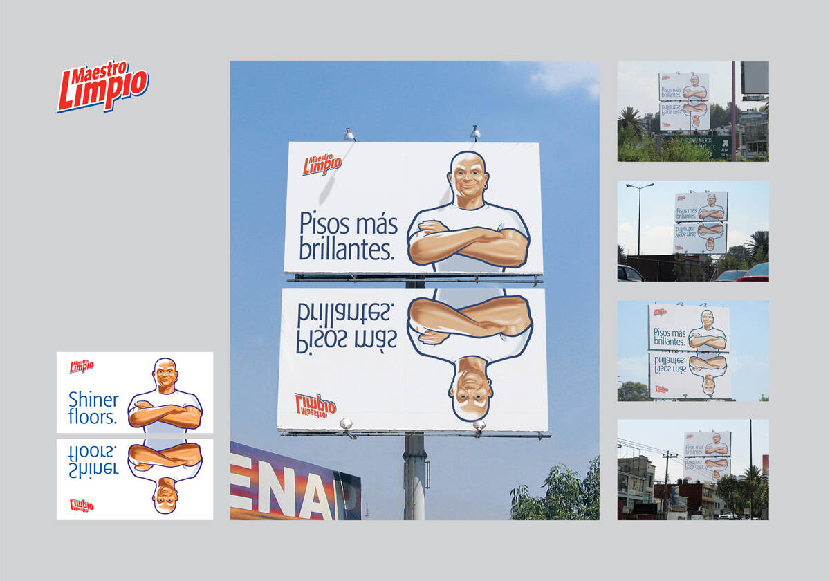
Maestro Limpio: Shiner floors
Advertising Agency: Grey, Buenos Aires, Argentina
Executive Creative Directors: Pablo Gil, Sebastián Garín
Creative Directors: Diego Rubio
Art Director: Diego Rubio
Copywriter: Coco Olivera
Advertising Agency: Grey, Buenos Aires, Argentina
Executive Creative Directors: Pablo Gil, Sebastián Garín
Creative Directors: Diego Rubio
Art Director: Diego Rubio
Copywriter: Coco Olivera
Ads of the World advertising archive and community showcases fresh creative campaigns daily from around the world. Read more
If you need a logo for your company or product you can get it done with us.
In our logo store you can pick from over 28,000 pre-made logos that will be customized to your name for free or you can post a contest for us for just $250 and our designers from all over the world will submit dozens of logo design suggestions to your specific needs.
25 Comments
great one
hmmm ho hum on this one.
Great insight!
me gusta!!
bueno
Not so much
Shinier.
I get the feeling only graphic designers will get it...
Also as you see it from below, it makes no real sense
The Ad Mad
simple and nice!
I didn't get it. wat's the product?
F'n stupid, if you want to demonstrate shinier floors get a F'n real surface and stop ridiculing consumers.
Add insult to injury then burn the candle at both ends.
:: Put your ears against the ground so i can walk over what you heard::
Do people really get it?
so simple and great!
It's cool, but what's up with the image of the guy who looks ready to make someone his prison bitch?
he is the mascot of the particular product.......so this one conveys the message very easily...its a cooooollllllllll thought.......good job guys..keep it up......
Infected by a virus called CREATIVE | "And ya I Love Everything"
http://addot.blogspot.com | http://creativecreepers.blogspot.com
Very nice simple idea!
obvious!
greaaaaaaaaaaaaaaaaaaaattttt job
Yes it is nice, i like it
Good idea but poor execution...the bottom image should have been like a real reflexion...strong at the top and fading at the bottom. El reflejo de abajo debio haber sido mas real y no tan literal...tipo gradient, mas fuerte arriba y disolviendose en la parte de abajo...buena idea pero pobre ejecución.
interesante.
[ http://eltubedeyou.blogspot.com ]
very well thought
jajajaja The invasion of 2.0 in outdoors
I hate all those comments "Done" What if it has been done? This is not Innovation of the World... This is Ads of the World, and what really matters is if it is good or not. I am pretty sure of something: You have had sex only once, because in 2nd chance you said... Done!
http://blog.luismaram.com
Very good Strategy... But avg. creative...
I agree that he is the mascot... but still...
THis whole concept could been executed in much better way...
---
a2obspl
www.alpha2omega.in
totally agree with bacolo69.
totally.
get an effect of reflection on the lower one.
very clever use of media spoilt by poor execution.
hélas.