Sea the Future Reel
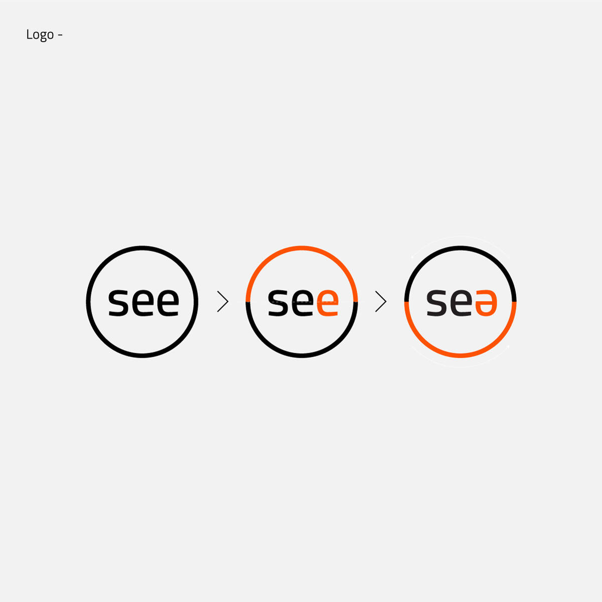
Logo Overturn
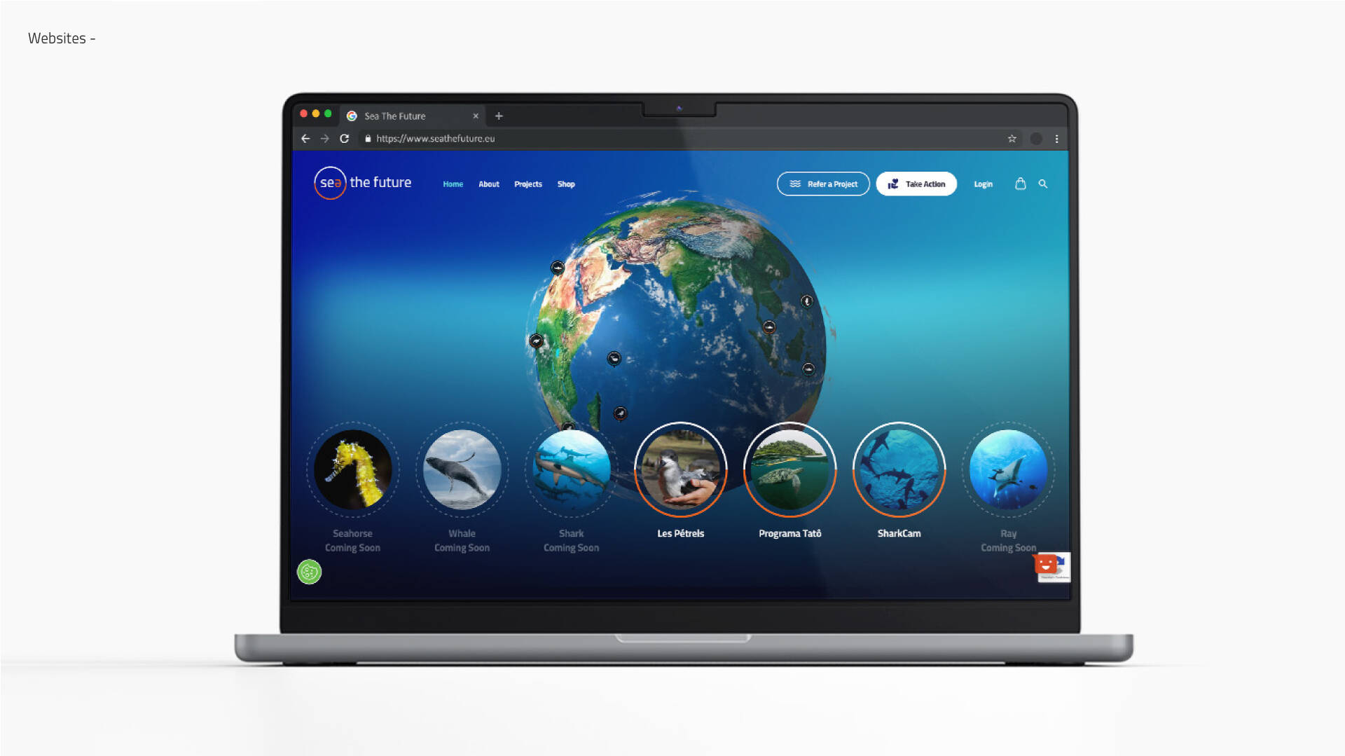
Sea the Future Platform

Sea the Future Color Palette

Icon Design

Set of Icons

Sea the Future Overview
Description
When we come together, as a shoal, we become powerful enough to be able to effect change. That is the notion that informs Sea the Future, Oceanário de Lisboa’s new venture, a user-friendly platform that aims to connect you to the community of scientists, activists, enthusiasts, and volunteers leading conservation projects around the globe so you can support them.
Sea the Future’s brand system was created by Flopicco Design Studio using a multi-disciplinary approach where brand strategy, marine life research and design sobriety meet.
Keys and Main Features
1. The circle. In nature everything is cyclical (the word comes from the Greek kiklos, and it means circle). The course of time and the seasons follow a cyclical movement through which everything is repeated and at the same time renewed. The circle is the core of this brand system and as such it informed everything from the logo to the icons and the motion graphics' elements.
2. The concept: Overturn. We emphasised the word play and double meaning that can be created with the words “see” and “sea”, as this is the basis of the brand’s name. The rotation of the “e” highlights the notion of a cycle and also the importance of powering a transformation, reversing a situation and changing both our point of view and our behaviour. Change, fortunately, is the only constant thing in this world, and it is what we need to do to save our oceans.
3. The font: Cairo. For the word play to work out we needed a simple sans serif typography. We selected Cairo because it was also a Google Font which means it could be easily applied to other features of the platform in an energetically efficient way as they are much more lightweight than other font libraries or self-hosted fonts.
4. Dark background. Darker colours are also energetically friendlier on screen and are harmonic with some of the principles of digital sobriety we took into account when building this brand. For consistency, whenever possible, the logo on screen should be against a black or dark background.
5. Custom-made icons. A series of icons were created for the platform to represent species, ecosystems and the selection criteria a project have to meet to be elegible to be part of Sea the Future.
This professional campaign titled 'The cyclical possibility of change' was published in Portugal in February, 2023. It was created for the brand: Sea the Future, by ad agency: Flopicco Studio. This 360°, Design, and Digital media campaign is related to the Education, Electronics, Technology, and Public Interest industries and contains 7 media assets. It was submitted about 1 year ago.
Credits
Client: Sea the Future
Agency: Flopicco Studio, Rome, Italy
Creative Direction: Flopicco Studio
Inhouse Team: Florencia Picco, Fernando Vallejos, Natalia Bellagio, Alejandro Guatelli, Daniela Parasporo, Pablo Camino, Martín Polech, Emiliano Agnetti, Leandro Nicolosi, Matías Pastorini, Soledad Basigalup, Sebastián Brown & Ana Laya
External Collaborators: Macarena Lateüade & Esteban Ibarra